Is Your Website Design “CRAP?”

In a Nutshell…
Graphic design contains underlying principles that govern the most important aspects of great design. These principles create the acronym C.R.A.P. which stands for contrast, repetition, alignment, and proximity. The well-balanced combination of these principles tends to create design which most people would consider visually pleasing.
The Best Acronym Ever… C.R.A.P.
If you’re like the vast majority of people, you’ll immediately think an acronym like CRAP would be negative in connotation. However, to say a design is CRAP is quite the compliment (we suggest not trying this with your designer). The original term was coined by writer Robin Williams in his book “The Non-Designers Design Book” written in 1994. All in all, the principles involved are easy to understand and we’ll show some examples for each below.
1. Contrast
Contrast is defined as “the difference in visual properties that makes an object distinguishable from other objects and the background” (source: wiki). We like to say it means to make some things stand out more than others. Just like a roller coaster needs some ups and downs, a website needs to have some variation and contrast.

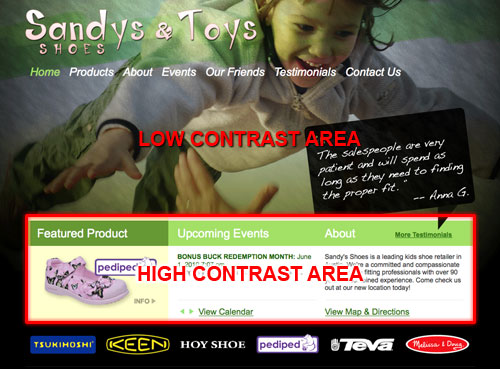
In this example, you see the background has a subtle yet powerful image. However, the foreground or informational panels almost jump off the page and catch your attention. This is a great example of contrast.
Things to Consider:
- Group things that are the same together
- Make things that are different stand out
- Don’t be “slightly different” (choose same or very different)
- Strong contrast helps visually separate content
- Good contrast makes a design more visually appealing
- Contrast is great for “calls to action” and “next steps”
2. Repetition
Repetition is defined as to “repeat styles down the page for a cohesive feel” (source: thinkvitamin). We like to say that the more you use similar styles and elements the more comfortable the user feels understanding and interacting with your design. By using repeating styles you create usability, trust, and ultimately action.

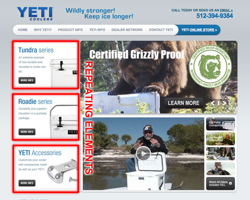
In this example of www.yeticoolers.com, you see that the informational panels all have the same style. The typography (text), buttons, and side-view photo of the coolers all share a similar style. By repeating the panels a user can easily choose based on the content alone without distracting design differences between each product options. This is a great example of repetition.
Things to Consider:
- Repeat design elements to create consistent “feel”
- If specific elements contain a certain style – use it elsewhere
- Repetition creates visual connections between content
- Repeating styles make a website more user-friendly
- Repeating styles reinforce their meaning to the user
3. Alignment
Alignment is defined as “lining up the top, bottom, sides, or middle of text or graphic elements on a page” (source: about.com). We like to say it’s a “rhyme or reason” to things being where they are. This quality is the single most important principle in great design and typically is the difference between professional design, and how can we say this… “unprofessional design”.

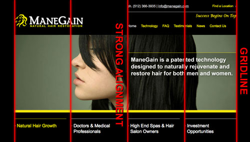
In this example of www.manegain.com, you see how the various elements of the page, while appearing in the header, the body and in the bottom of the page all align in the same invisible grid. While most people will not realize this aspect of great design, it is quite literally CRITICAL in creating beautiful designs. The more you start looking you will see an underlying grid to nearly all great design.
Things to Consider:
- Quality alignment is CRITICAL to great design
- All page elements should be visually connected to something else
- Alignment of important content items creates attractive design
- Underlying grids help make a design flow more naturally to users
- Choose left align, center align or right align (don’t mix)
- Make sure to match spacing/padding when you align items
4. Proximity
Proximity is defined as “the property of being close together” (source: thefreedictionary.com). We like to say it’s grouping things that act, look, and feel alike, close together and separating different elements to create more user-friendly websites. Proximity is used to connect like items and separate site content into digestible chunks. By creating a less proximity (less closeness) you can “set apart” or highlight specific items in a design.

In this example of www.tbic.com, you see how there is a very large amount of “white space” (low proximity) around the major service offering, “A Texas based Workers Compensation Insurance Carrier.” While there is an image in the background, the lack of other visually complicated items has been purposely eliminated to create a strong compelling urge to read the sentence and act on the “Know More”. This is a great example of proximity (or lack thereof).
Things to Consider:
- Proximity creates meaning
- Elements that are alike should be grouped
- Items that are different should be kept apart
- The more spacing elements the clearer the difference
- More spacing means LESS connection in elements
- Clear separation makes navigating a website easier
What have we learned?
Creating a great design is more science that one might think. There are quite a few fundamental principles behind the scenes guiding and directing a designer to achieve great results. By simply following the four basic principles of CRAP (contrast, repetition, alignment, proximity) you’ll be well on your way to aesthetically pleasing design. Glide Design is an Austin Texas Web Design agency specialized in extraordinary websites.

Discover the key insights on how AI-driven search is reshaping digital visibility.
