19 Web Design Mistakes that Will Kill Your Web Traffic and Site Conversions

There are some web design mistakes that may or may not have impact on a website’s success, but there are others that act as conversion killers.
They spell death knell for web traffic and make sure your website and its prospects go downhill unless something is done to get rid of these mistakes. On a scale of 1 to 10, where 1 refers to mistakes with minimal adverse impact and 10 means errors that leave a disastrous impact, ‘conversion killing’ mistakes score a perfect ten and then some more.
To know these mistakes is to avoid them, so let’s take a closer look at what these mistakes are. Note that this list is given in no particular order of importance.
1. Excess
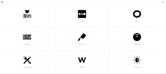
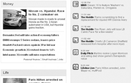
Image Source: http://mimarch.net/
I come across plenty of websites that have gone overboard with the use of their design elements. There is an excess of just about everything. Whether it is images, animation, or something else, designers behind these websites have gone overboard and cluttered the page layout. As a result, visitors have very little idea of what the website is trying to convey, and confusion is the order of the day. As you may imagine, visitors make a beeline for the exit when they come across such sites.
2. Important Information Below the Page Fold
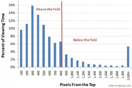
The page fold is the single most important aspect of the page layout that every designer must take into consideration while designing a website. Visitors decide whether a website is worth their time or not in as little as a few seconds. This means you have very little time to make an impression on your visitors, and this is where the importance of the page fold enters the picture. The golden rule of page fold is simple – all important information must be above the fold.
If your important call-to-action buttons or website messages are below the fold, the chances that your visitors will come across the information they are looking for are slim; very few of them will scroll down to check out the information below the fold the very first time they are visiting your site. If this happens, say goodbye to any chance of achieving an acceptable conversion ratio.
Image Source: http://www.nngroup.com
3. Client Oriented but not User Focused
Most web designers design a website according to precise client requirements. But some of them overlook their target market in the process, meaning the end users who will actually visit the site. Lack of audience research or not being clear on who your users are, is the main culprit here. This means you make designing decisions based on assumptions, usually wrong, which at the end of the day result in user dissatisfaction with your website. It is only tremendously user-oriented websites that are able to experience a high degree of conversions. Understand the user, and implement this understanding while designing your site.
Image Source: http://kyletezak.com
4. Not Being Able to Distinguish Between Attractions and Distractions
At times, it is not excessive use of a particular design element that confuses a visitor, but the use of the wrong design elements that distract users from the website’s message. This means the visitor’s eyes are drawn to the less important parts of your website’s pages because you’ve placed certain design elements where they shouldn’t have been placed; or you have surrounded important buttons or visuals with other imagery that doesn’t allow visitors to focus their attention them.
Think very carefully about your designing choices. For example, you might be gung-ho about using a large background image on the Home Page of your site, but if it interferes with the eye-flow of the site, then don’t use it.
5. Unclear Call to Action
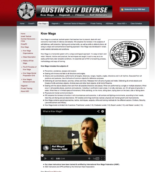
Your website isn’t a work art; visitors won’t come to your site just to admire its design. The website serves a purpose. Its job is to achieve a set of objectives through visitors’ actions on the website. It needs to have clear call-to-action that tells visitors what to do when they’ve landed on your website- whether it is buying your product, contacting you for a quote, or subscribing for a newsletter. If your site isn’t very clear with its call-to-action button and doesn’t answer the question, “What next?” then conversions won’t happen.
Site Before Call To Actions Added:
Image Source: http://www.AustinSelfDefense.com/krav-maga
Site After Call To Actions Added:
Image Source: http://www.AustinSelfDefense.com/krav-maga
6. Focusing too Much on Trends
Articles such as the 7 Web Design Trends You’ll Actually See this Year are great reads and tell you where the world of web design is headed in terms of the latest developments and technology. But it’s important to understand that an undue focus on trends without really considering their purpose can actually have a detrimental impact on the design. Your decision to implement a particular trend should be backed by sound knowledge of how it needs to be implemented and the benefits it will bring to the table. Riding trends just for the sake of using them will not work in the long run.
7. Choosing Style over Substance
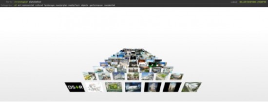
The use of cool design elements are great, but do these elements help deliver the website’s message with impact? This is the question that needs to be answered. Do not choose design elements purely based on their cool quotient. Your choice must depend on their ability to meet web usability design standards. This will ensure that these elements fit seamlessly within the framework of your web design concept and will prop up your conversion ratio.
It’s important to remember that it’s not ‘coolness’ of the design that will prop up its conversion ratio, but each design element coming together to serve a larger purpose, which incidentally is – better conversions.
Image Source: http://www.dsrny.com
8. Not Using Color as a Design Element
Have you been using color as an afterthought rather than thinking of it as a critical element in your page layout? If that is the case, you’ve got your design priorities all wrong, because color is one of those design elements that plays a huge role in conversions. Unfortunately, it is relegated to being a decorative element on many websites.
Different colors are associated with different emotions, and the right color combination helps you weave the kind of emotion you want within your design. Designers need to be very clear about color theory to ensure they are able to make colors an integral part of their website design process.
Image Source: http://www.webhostingsearch.com/articles/25-ways-to-make-your-site-more-accessible.php
9. Too Loud
“Websites that shout the loudest attract the attention of the target audience.”
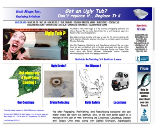
Is the statement right or wrong? The statement is wrong if by “loud” one means “garish”- the kind of website that tries too hard to make an impression. Such websites are a mash-up of visuals that are heavy on the eyes. Mind you, this doesn’t mean that the design is cluttered; it just means that it doesn’t display the kind finesse that one associates from a reputed website.
The visual effect is so loud that it shocks the user rather than leaves a positive impression. As can be imagined, this isn’t good news from the conversions point of view.
Image Source: http://uglytub.com
10. Inconsistencies
The style that you use to design your website must be consistent throughout its web pages. If your headers, content, etc. have different attributes throughout the website, then it’s going to look bad. For example, if the sub-header is red on one page and some other color on the other pages, then the inconsistency is going to come out very strongly and be a distraction. You can mix and match design elements and their sizes, but this needs to be done within reason. If you do it just because you cannot be bothered to maintain consistent styling, then you might also have to contend with a negative reputation.
11. Never Ending Website Text.
Here, we are talking about text that just seems to go on and on, without any breaks. Long blocks of text on your website will do nothing for its conversion rate. The truth is that it is not very readable and just bores visitors to death. If you want your website to convert, then making sure you’ve readable content that is broken into short paragraphs and bullet points will help. Your visitors need to be able to scan through the text and get to the most important text quickly. This will help boost user engagement and also the website’s conversion ratio.
12. Lots and Lots of Textual Content
Long blocks of content and enormous amounts of textual content are two very different things. In the latter, you are packing your website to the brim with text, and this isn’t good news for your reader. In this case, different blocks (irrespective of their size) are vying for visitor attention from all corners of the page. This is a recipe for confusion and conversion disaster. One reason you need to place only the most important text on a page is because such content is more share-worthy.
This brings us to our next point.
13. Social Media Unfriendliness
Do the pages on your site have social sharing buttons? Does your site have a blog? If the answers to these questions are NO, then this is a strong reason that your website is not attracting a lot of traffic or why conversions are not happening. Site design needs to be social media friendly, meaning you must ensure that visitors can share the onsite content easily with their friends and followers on social media. What this also means is that you need to bring social media experiences to your website in different ways. This improves the interactive and engagement quotient of your site, which attracts more website traffic and improves conversions.
14. No Responsive Mobile Web Design
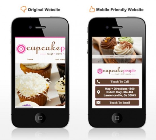
If you want to design a website today, then it should not only render effectively on desktops and laptops, but also on smart phones and tablets. That’s because a large section of the website’s audience is going to access it using their mobile devices. If the website doesn’t offer a satisfying user experience on mobile, then it won’t succeed. And it is responsive web design that guarantees a solid, reliable, and highly effective presence on mobile for your website.
Image Source: http://nvate.com/15538/mobile-friendly-website/
15. Lack luster Typography
Website visitors are looking for the best from your site. One way of ensuring you deliver on their expectations is to use the right typography. Ideal typography is unique, is legible, accentuates the overall website styling, is of the right size, and has appropriate spacing. Using common typography is not a huge error by itself, but if it’s a part of an ordinary-looking website, then it could have an adverse impact on conversions. On the other hand, the judicious choice of web typography with an effort to use something new and unique will improve the visual appeal of the site.
16. Poor Navigation
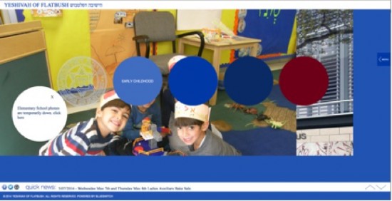
A website user wants to reach point B from point A on a site quickly and conveniently. Your site navigation must be self-explanatory, simple to use, and have a hierarchical structure. In many cases, it is bad navigation that acts as a party pooper. Navigation helps people go through the website, peruse the information it has on offer, and make an informed decision. If they are unable to do this with ease, then say goodbye to any chance of your website experiencing high conversions.
Source: http://www.flatbush.org/
17. Irrelevant Images
The choice of images on your website must be relevant and pixel perfect. While this may look like something that most web designers will get right, this isn’t the case. Some designers don’t make the effort to pick the right images for their website. This is a huge misstep. It is images that make or break a website, and the use of unimpressive images that do not have complete relevance to the website’s purpose do not resonate with visitors; this also acts as a barrier to conversions.
18. Lack of Functional Appeal
What comes first in website design- form or function? There is no clear answer to this question, but you will do well to go with function first followed closely by form. Things like site load time, browser compatibility, platform, animation, etc. need to be spot on if you want the design to work its magic on website visitors. Lack of functionality destroys the UX of a site, and this is why form must closely follow function and not the other way round.
19. Unplanned Process
And finally we have lack of planning. Web designers are busy these days, and they handle multiple projects at a time. This means some of them make compromises while planning the designing process to speed things along. As a result, the design is handled in a haphazard fashion with more importance given to completing the design process than ensuring that it is done well.
To Conclude
Avoid these 19 mistakes, and you will be on course for creating a website that attracts plenty of traffic and exhibits a good conversion ratio. Did we leave anything out? Tell us what you think about these tips. If you have any more comments to share, feel free to share away in the comments below.
About the Author:
Joshua Geary is prolific blogger and marketing consultant for Glide located in Austin, Texas.

