11 Persuasive Web Design Techniques to Improve Conversions


Discover the key insights on how AI-driven search is reshaping digital visibility.
Each day, people face tens of thousands of decisions that span everything from when to leave for work to what purchases they’ll make.
And for many, the first interaction isn’t with the sales representative, but a website. How can we convince people to buy if we can’t sell using confidence and reasoning?
Persuasive web design uses psychology and design principles to motivate people to make a purchase or take a specific action on a website. Though often used in ecommerce, persuasive design can be effective in software-as-a-service, public benefit corporations, and nonprofit organizations.
What Is Persuasive Design?
As humans, we hate to make decisions. We spend more time building shortcuts in our memory to help us avoid reevaluating the same thing than we do evaluating it. Making a rational, evidence-based decision takes too much energy.
Persuasive design documents and uses these cognitive biases and psychological insights into persuasive patterns to influence human behavior through a product or service’s characteristics. Designers document recurring solutions to solve common design problems and use them as a reference point for the future.
Think persuasive design is limited to ecommerce sites and major brands? In a study of apps related to health workforce capability, persuasive design techniques and their implementation was shown to align with the needs of health professionals, particularly for rural or remote workforces.
In another study, persuasive web design was used for primary healthcare electronic records. The results showed:
- Improve medication adherence by nearly 32%
- Improved mental health and wellbeing by 40%
- Higher physical activity by 47%
- Healthier eating by 61%
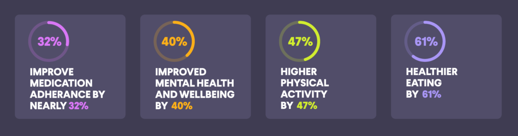
These findings are encouraging the community to promote better adoption of EHR-integrated consumer portals.
Persuasion Techniques in Psychology
Humans may believe themselves to be rational, but our brains are affected by a wealth of external stimuli, motivations, and visual cues. A million minuscule details can inform our decisions – including how well we slept the night before or whether we’ve eaten recently – and we later use logic to rationalize the “why” of our decisions.
The study of persuasion has a long and storied history that dates to Aristotle and the Greeks. In the 20th century, social scientists joined modern philosophers in reaching a greater understanding of the principles of persuasion in human decision-making.
According to The Psychology of Persuasion: How to Persuade Others to Your Way of Thinking by Kevin Hogan, persuasion is “the ability to induce beliefs and values in other people by influencing their thoughts and actions through specific strategies.”
In 1984, Dr. Robert B. Cialdini wrote a book called Influence: The Psychology of Persuasion that further defines persuasion. It’s since become a staple in marketing and web design.
According to Cialdini, the 6 Principles of Influence are reciprocity, commitment and consistency, consensus or social proof, authority, liking, and scarcity. For decades, these six principles have been adapted to other fields, including marketing, to improve conversion rates.
At its core, marketing is – and always has been – all about persuasion. Brands want to turn leads and visitors into paying customers.
Persuasive Design Techniques
Humans consider a lot of information when making decisions, most subconsciously. Every page should have a clear action that users should take, and it’s the job of marketers and web designers to guide users to that action.
Designing a persuasive website isn’t just about aesthetics, but implementing strategy.
Persuasive design techniques can be powerful tools to encourage decision-making and improve user experience.
1. Likeability
According to Cialdini, the more you like someone, the more likely you are to be influenced by them. “Liking” is based on sharing something similar or a more superficial interest, such as physical attractiveness.
This principle can be applied to persuasive web design in creating a website that users like as soon as they land on it. First impressions are key – users have to find the site memorable and unique from the start, and the communication and messaging has to resonate.
You’ve probably experienced this yourself.
You click on a website and immediately click away – something about it turned you off, but you didn’t spend enough time browsing to know exactly why.
First impressions are formed with striking speed and consistency. They exert a measurable influence over behavior, possibly due to our evolutionary imperative to distinguish friends from enemies.
We form first impressions based on things too, such as a website’s design, to decide whether we’re interested. This may depend on the structure, colors, spacing, symmetry, text, fonts, or other elements.
Based on a Google study, the first impressions of a website are influenced by two design factors:
- Visual complexity: How complex the visual design appears.
- Prototypicality: How representative a design is for the category of websites.
Based on the results, participants made these judgments within 17 to 50 milliseconds. The designs that came out ahead were both simple (low complexity) and familiar (high prototypicality). Designs that contradict that may hurt the first impression and damage the users’ expectations.
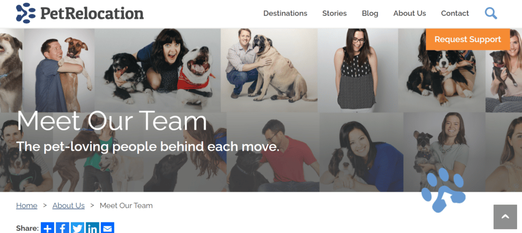
An excellent example of this is PetRelocation.com, an Austin-based firm that helps pet owners around the globe move their pets. Throughout the site, users will see an emphasis on the love of pets and detailed information on all of the staff.
2. Clarity of Information
You can have a perfectly targeted, beautiful site, but if the information on it is unclear to the user, you’ll have high bounce rates.
Clarity is one of the most critical components of web design. The effects of a well-designed (or poorly designed) website are thoroughly documented.
Similar to likeability, the challenge is taking complexity and making it simple, clear, and straightforward. Clarity is how accessible and comprehensible the information is, which includes the navigational paths, interactions, user interface, and copywriting.
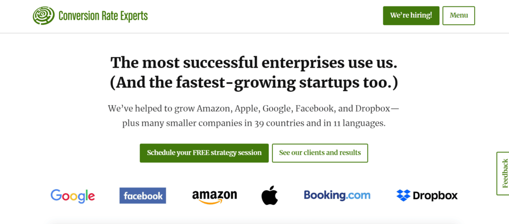
Conversion Rate Experts is a great example of copy clarity. The entire site features authentic, high-impact copy that’s complex but delivered in a simple, straightforward way.
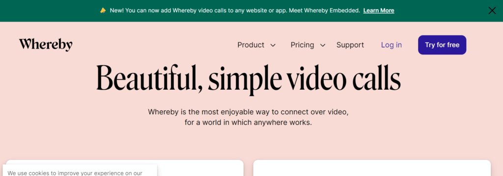
Whereby is another example of clarity of information. The navigation, site hierarchy, and CTAs are, as the brand describes its service, “beautiful and simple.”
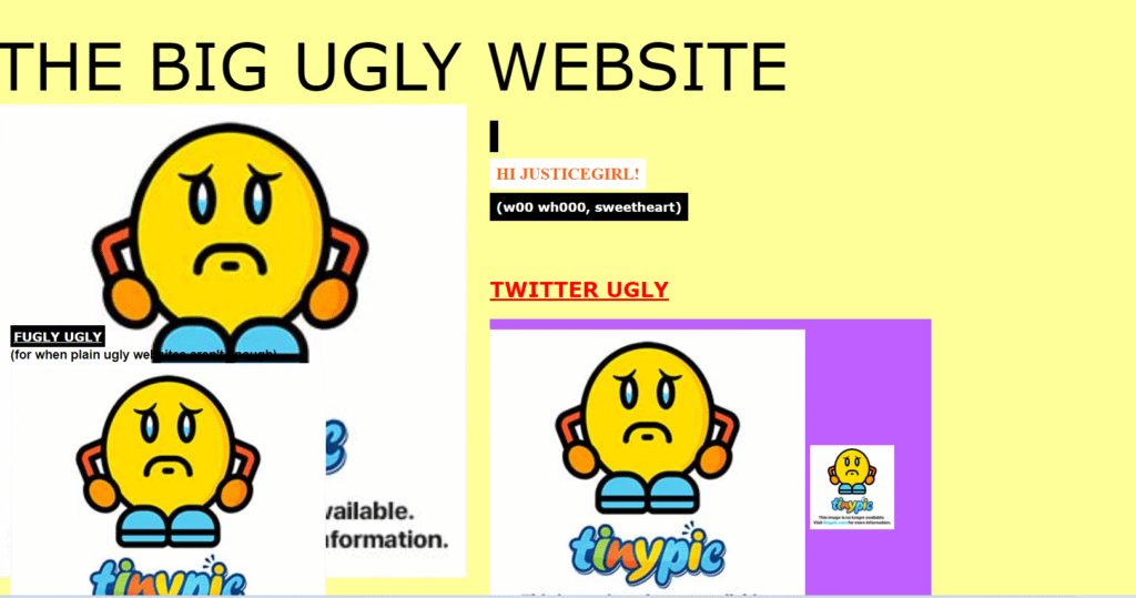
And what not to do? The Big Ugly Website was created as a demonstration of everything you should avoid in your web design.
3. Users in Control
Humans have an innate desire to be in control. At its simplest, this is nothing more than wanting things to be the way we want and keeping them that way until we decide otherwise.
With this in mind, users need to feel like they are in control of everything when they visit a website. From their personal information to the information they’re seeking, they want to be in the driver’s seat to control their experience.
This can take many forms, including “are you sure?” messages, undo/redo functionality, cancel buttons, and light and dark mode toggle.
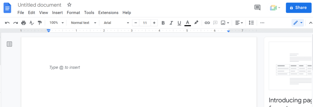
Google Docs has excellent examples of user control features. Hovering over any icon on the document reveals the meaning and shortcuts, no matter which platform you’re using. Though comparable platforms have similar tools, Google makes it quick and simple.
4. Designing for “Default”
Remember how the human brain takes mental shortcuts to avoid reevaluation? Designing for default plays on that.
In a study of organ donation volunteer rates across European countries, organ donation is higher in countries with presumed consent like Austria and Belgium. In these countries, citizens have to “opt-out” to indicate that they don’t wish to have their organs harvested.
In countries with explicit consent policies (opt-in), like Germany and the Netherlands, the organ donation rate is much lower – 15% to the opt-out percentage of 90%. Researchers attribute this difference to the effort and initiative required to participate. It’s simply easier for a participant to be registered as an organ donor in an opt-out country than an opt-in country.
To take advantage of this in design, it’s important that the defaults benefit the brand and the user. For example, filling out a long form could be enough to send a user elsewhere to find an easier process.
Default should be what the majority of users will want. You can pre-populate fields with value if you know what it will be in advance, such as the United States as a geolocation if most visitors are US-based.
It’s important not to use defaults for input fields that require user attention, such as signing up for a newsletter to accepting the terms of use. Also, the default should be easy to change.
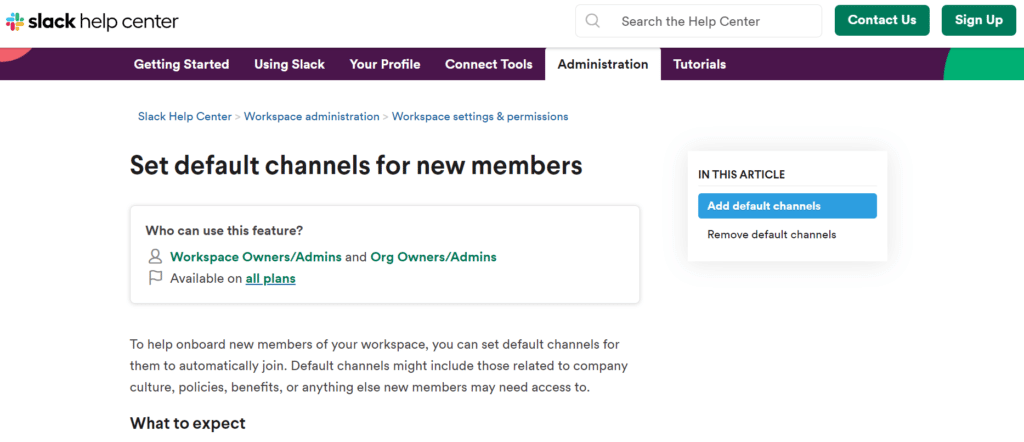
For example, Slack makes users aware of default settings and how to update them.
5. Novelty
Humans love and seek novelty, which is strongly tied to happiness.
By definition, novelty is anything that’s new to us, which could be buying something new, meeting someone new, learning a new skill, or spending time in a new place. Even if old, familiar favorites are available, we will still choose to explore the novel option.
One of the challenges is that novelty is hard to hold onto. The newest and most creative ideas eventually become old and familiar. Eventually, the novelty wears off and you’ll need to find something new and interesting.
Our brains pay attention to patterns and ignore that which is predictable, routine, or boring. We pay attention to what’s different, which is why many sites constantly update their text, images, and color scheme to keep things interesting.
Novelty should be balanced with the other priorities of design, however, such as a fun experience, an intuitive experience, an aesthetically pleasing experience, and usefulness. A useful design is necessary, and it should be beautiful and intuitive. Fun can be added as long as it doesn’t trump usefulness.
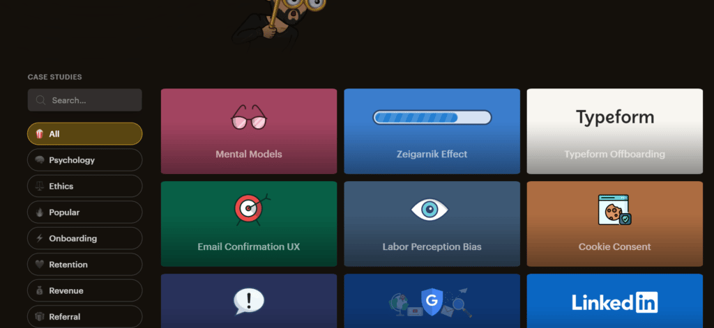
A great example of this in practice is Growth Design’s case studies. They’re not only useful, but they provide a novel, intuitive experience that makes learning exciting.
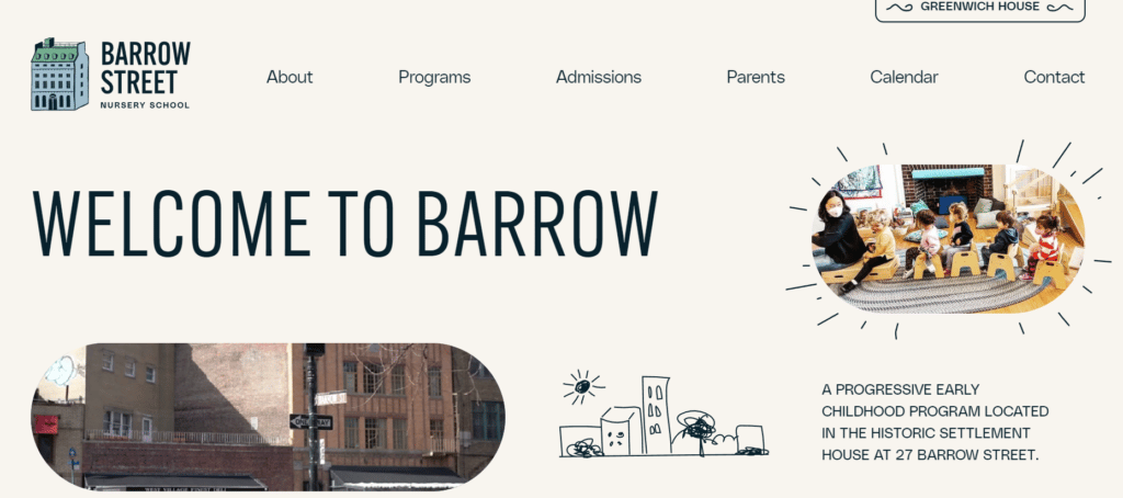
Another example is the Barrow Street Nursery School, which draws the eye in immediately and communicates the brand personality effectively.
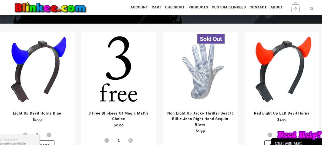
Novelty in the images or typefaces can be fun and new, but they can’t be so different that they compromise clarity or aesthetic beauty. Blinkee.com is a good example of novelty gone bad.
6. Reciprocity
Reciprocity is one of the most important of Cialdini’s principles, yet often one of the most unrecognized. According to Cialdini, the rule of reciprocation refers to the universal tendency for human beings to feel compelled to repay or reciprocate when given a gift of any kind.
Gift exchange has been an element of virtually all human cultures throughout history. Our ancestors learned to share food or skills to survive better as a group.
Not being a “taker” is heavily ingrained in us from a young age, which is why we feel compelled to take a salesman up on a “good deal” or make a purchase after receiving a free sample.
People want to reciprocate when things are given to them, so we can put ourselves in a position of giving benefits, advantages, and information to have it come back to us.
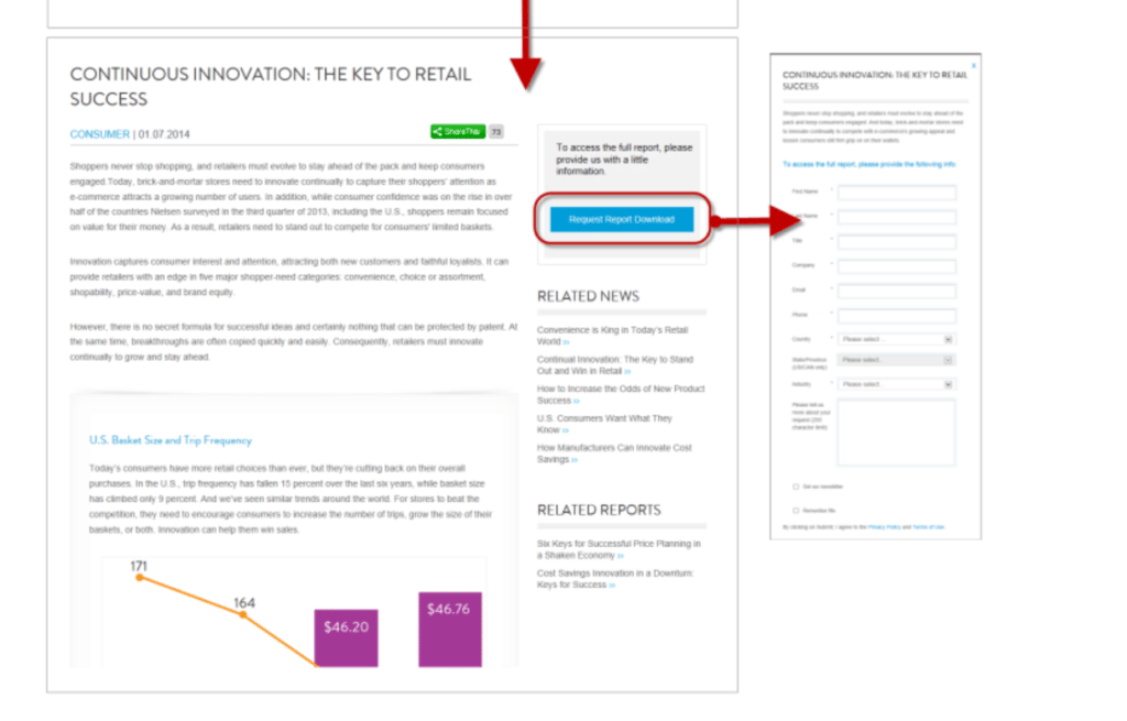
This is the concept behind gated content, though it can act as an incentive or a turnoff. According to studies from The Nielsen Group, users enter fake information if they encounter overly aggressive lead-generation forms before the website establishes its credibility.
Conversely, users were more likely to provide information if they were taken to a landing page with a summary of the resource they’d be downloading. This not only shows that the company is respectful of the user’s time, but it allows them to make a more informed decision about whether they see value in sharing their information.
7. Social Proof
Social proof refers to the tendency of human beings to follow the actions of others when making decisions. This can be used to deliver credibility or promote adoption or acceptance.
According to Cialdini, “People want to follow the lead of many similar to them. If those people are moving in a particular direction, that’s a good signal in the direction to move to. Any communicator that can give that information about how what they have is the most popular or trending in a particular direction, they will grab user attention.”
Brands can showcase social proof in many ways, including user reviews, expert testimonials, links to a social feed, trust signals, or certifications, such as the blue checkmark on Twitter or Facebook.
Roughly 90% of customers read reviews and consider them in their purchasing decision. Third-party review platforms are more recognized and trusted by consumers, due to the perceived objectivity of the site vs. the brand itself.
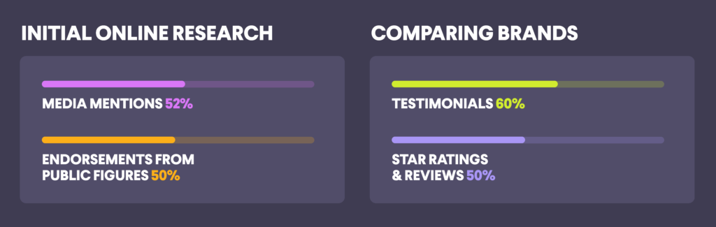
According to research from Hubspot, customers prefer different trust signals throughout the buying journey. Media mentions (52%) and endorsements from public figures (50%) were effective when customers performed initial online research, while testimonials (60%) and star ratings and reviews (50%) were effective when customers compared different brands.
There are also different responses to trust signals from different generations. As a brand, it’s essential to understand who your customers are so you can share the most effective trust signals.
8. Authority
The authority principle is one of Cialdini’s principles of persuasion. This refers to a person’s tendency to comply with people in positions of authority, such as government leaders, law enforcement, doctors, lawyers, and other perceived experts.
People believe that they have higher wisdom and power and complying with them will lead to a favorable result. Remember, we prefer to make the easier decision. We also grow up looking to authority figures, and in adulthood, we recognize when someone has expertise outside of our own.
You can take advantage of the authority principle to improve credibility with tactics like:
- Showing images of people in authority positions
- Using symbols of authority, such as the caduceus or staff of Hermes, a symbol for the practice of medicine
- Logos or reputable organizations or brands
- Endorsements from experts or other authority figures
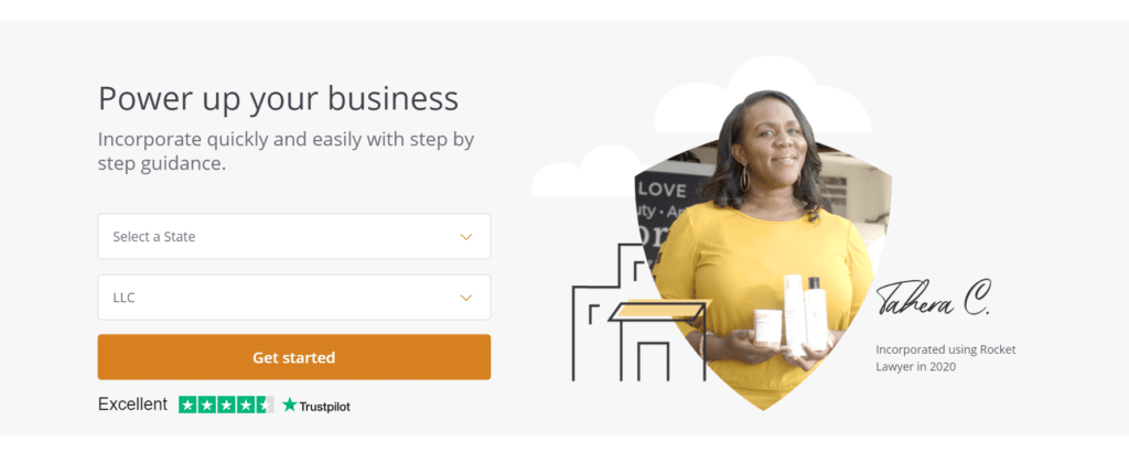
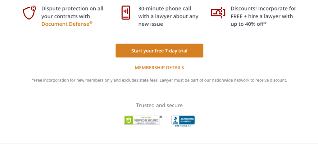
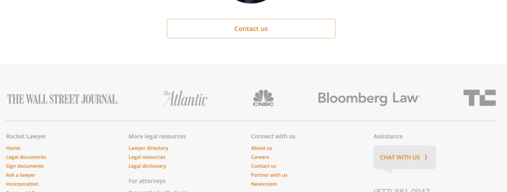
RocketLawyer.com has several indicators of authority, including a Trustpilot rating, BBB accreditation, logos from The Wall Street Journal, CNBC, and The Atlantic, and images of attorneys on staff.
9. Commitment & Consistency
Commitment and consistency are tied together as our tendency to behave in a manner that matches past decisions or behaviors. We default to ease decision-making and stay consistent to it, which is easier than making a new decision each time.
Cialdini’s research revealed that people will not only go out of their way to behave consistently, but they’re more positive about their decisions when they show consistency. And once the decision is made, people feel pressure to stick to it.
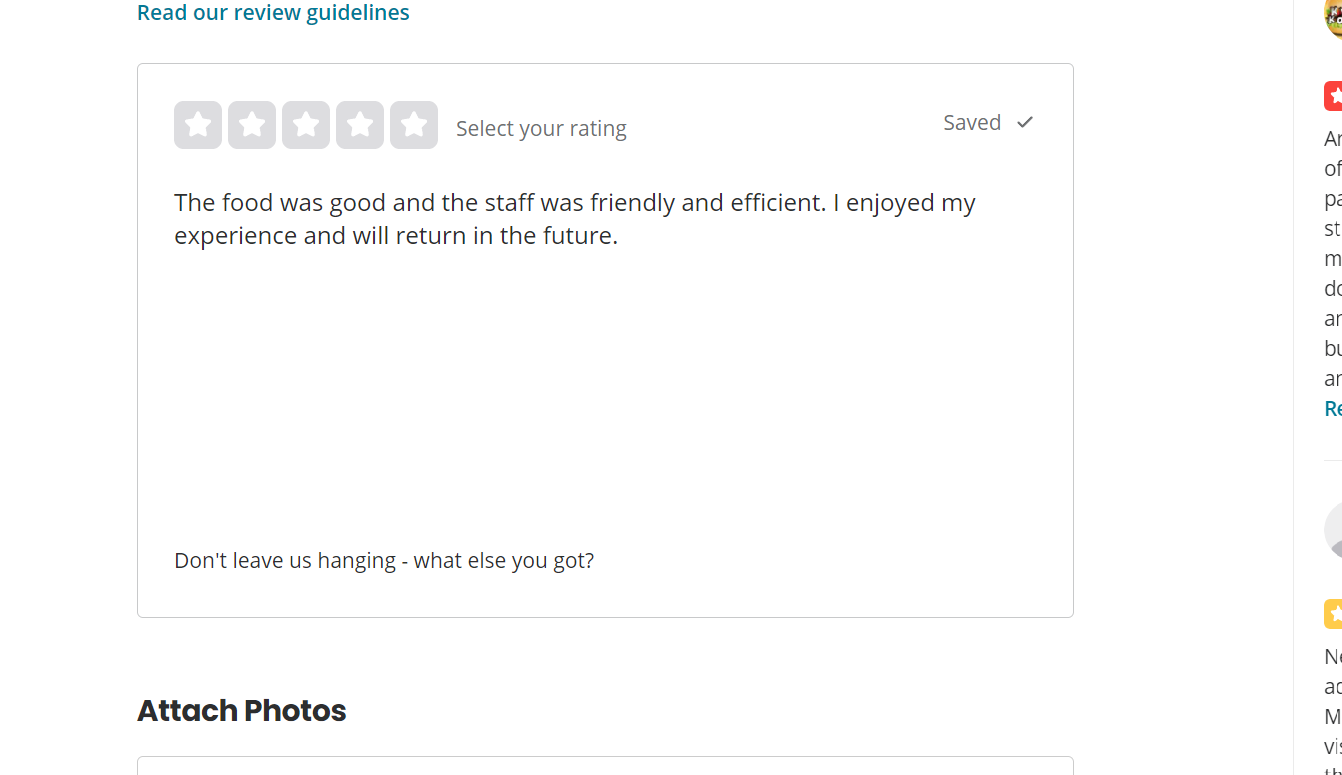
In design, behavioral consistency requires users to make an initial commitment to a desired activity. This has to be low-stakes and easy to make. A good example is Yelp, which allows people to start a review without creating an account. It’s both low stakes and easy – it can be done in one click.
Once the user begins typing the review, the form field presents motivational microcopy to remind the user to commit to finishing the review and writing more.
What is that microcopy?
“Don’t leave us hanging – what else you got?”
10. Scarcity
Scarcity is a well-known principle in marketing and sales. According to Cialdini, it’s the “Idea that people want more of those things that they can have less of. Show people that what we have is limited or dwindling in availability, even if it’s not.”
Scarcity is effective because of a cognitive bias known as loss aversion, which determines that people put more subjective value on loss over gain, and by extension, would rather avoid losses than acquire gains. We feel that if we don’t act on a scarce product, it’s a loss.
Black Friday is a good example of scarcity. Limited products are for sale at discounted prices, leading to a mad dash for customers to make their purchase. Art and fashion markets also use different aspects of scarcity to encourage purchases, such as limited-edition designs, limited quantities, or limited inclusion.
When people think something is rare or only available for a limited time, they will act fast to secure it. This principle can be used in user experience design, but only if it’s true scarcity.
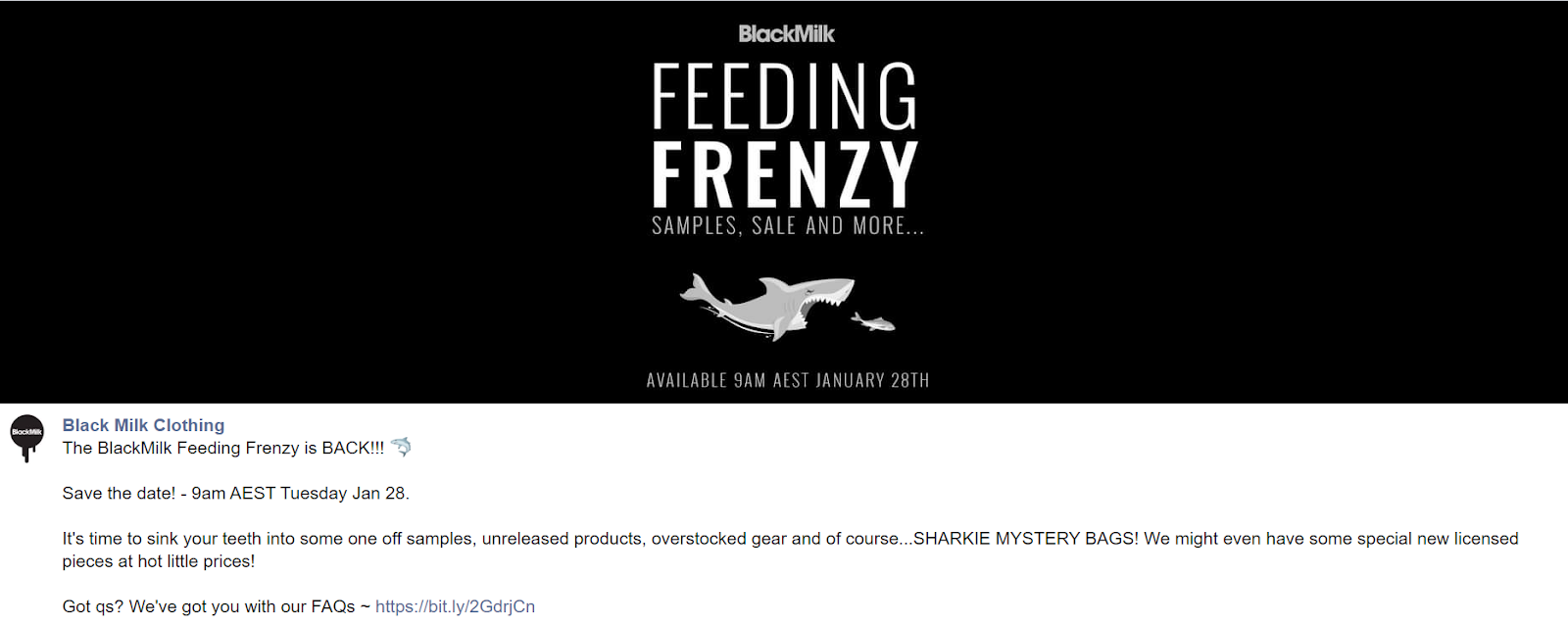
A good example of scarcity in practice is Blackmilk Clothing, an Australian clothing brand that releases collections with a mix of limited, 7-day unlimited, and staple items. The limited products are available on the collection page, as well as a separate “Last Chance!” page. On each limited product, there’s a “Limited” icon that says, “This is a limited product – once it’s gone, it’s gone, so get in quick!”
And it works.
Blackmilk Clothing routinely sells out in-demand products within minutes of the collection release.

Of course, customers know that these items are truly limited. Ecommerce sites will often use a tactic that states “only X number left” when it’s not the case. It may work once, but customers quickly catch on to the manufactured scarcity.
11. Unity
Though not one of Cialdini’s original principles of persuasion, unity is the shared identity that the influencer shares with the influenced. This goes beyond surface similarities to shared identities. It speaks to the need to belong to a group, which makes us more susceptible to persuasion attempts.
This sense of camaraderie comes out when people talk about sports or their university or their favorite television shows. In a more obnoxious context, it can apply to political movements or parties.
In design, brands can create this sense of camaraderie that encourages users to be part of the exclusive group. The Chubbies brand “manifesto” does this with the “Chubsters Nation” and sense of humor.
Blackmilk Clothing also creates this sense of community by calling its customers “Sharkies” who “nom nom nom” limited items in a “feeding frenzy.”
Ready to elevate your persuasive web design? Contact us to discuss your project!
Discover the key insights on how AI-driven search is reshaping digital visibility.
Discover the key insights on how AI-driven search is reshaping digital visibility.