What does your User Experience say about your Website?

If your website is well established, well designed and even rocking new leads… it’s hard to think that there is much wrong with your website, if anything at all!
Maybe your website is struggling in every way… either way, we’re here to help.
It’s extremely vital to your website’s success that you understand how your website appears to your customers and potential customers, regardless of how well or challenged your website’s performance is right now.
Even more importantly, you must understand how responsive website design and UX (User Experience) play into your customers’ perspective and experience.
These key points are what need to be considered in order to design a website that is responsive, looks beautiful, AND does so on all devices.
Pro tip: Check out your site with this mobile friendly test made by Google.
Responsive design
Responsive design refers to an approach in web design that provides an optimal viewing experience across a wide range of screen resolutions and devices.
Responsive design is so important. In fact, it’s recommended by Google as one of the easiest ways to implement and maintain a mobile site. Websites that are built using mobile responsive practices will generally load much faster, thus helping to boost site rankings overall.
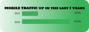
Mobile traffic is increasing every year, totaling a 222%+ increase in just the last 7 years. In the past 7 years, we’ve seen global web pages accessed via mobile devices more than triple:
- Mobile devices made up 16.2 percent of worldwide traffic in 2013
- Mobile devices made up 53.3 percent of worldwide traffic in 2019

Knowing the importance of designing for mobile visitors, here are a few important things to keep in mind to make sure your website is responsive:
- Make sure to test out what the user experience is like from multiple types of devices using a tool such as MobileTest.me
- Make sure to serve all devices on the same set of URLs, with each URL serving the same HTML to all devices
- Make sure to use CSS to change how the page is rendered on the device (per Google’s recommendation)
- Make sure your website has a separate mobile and desktop version
- Make sure to optimize your images for your website by reducing size using a tool such as TinyJPG
- Make sure buttons are easy to click on when using smaller screens
- Make sure to optimize typography for smaller screens and ease of reading
Pro tip: Keep your website mobile and desktop versions separate. Simply put, a desktop site doesn’t display well on our tiny devices. Mobile sites often exclude certain features, use reduced-sized fonts and images, and are an overall more simplified version of your desktop site.
User Experience
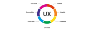
User experience is made up of a bunch of things—the feel, the look, and the usability of the website.

The experience for any given visitor is important. Just like as you’re reading this on our website, surely you can appreciate the great job our web developers and designers did (great work guys!).
There’s nothing more frustrating than going to a website and…
- The links are broken.
- The images are blurry.
- The navigation is challenging.
- It just makes for a terrible… User Experience.
- Like it’s 2000 again.
So, what are some things you can do to avoid giving a terrible User Experience, and—even better—create the best User Experience?
It’s really easy to choose designs that look and feel good to just you.
It’s important to focus on a website design that fits your user base. After all, that is who your website is targeted at. Developing data-driven Ideal Customer Profiles or data-driven marketing personas can help get you there. Once you understand WHO you are targeting, you can then create the rest. The end result is a beautiful website that resonates well with your target audience.
Pro tip: When you create an optimized image in terms of dimensions, combined with beauty, you get a great overall feel for the experience. Your users will love it (whether they realize it or not!).
Do NOT forget the basics!
The fundamentals of a website are what really keep the ‘bones’ (the structure or framework) of the site in great order!
Don’t forget it.
Let’s jump into a few User Experience checklist items:
- Don’t overlook the basics of functionality (don’t forget the menu)
- Define your website goals (in depth!) – Do you want to capture leads, begin a blog, increase your website traffic, or even grow your email subscriber list?
- Make your navigation process seamless (clean menu, great typography, great sizes, beautiful colors)
- Define a clear call to action
- Create enough white space between text and imagery
- Improve page load times
Pro tip: Make your buttons not too big or too small, so your buttons are easily visible and cannot be missed.
Each individual goal helps map out the future and helps pave the path to what your goal may be.This takes an in-depth understanding of what you want. And then planning accordingly.
For example, if you want to blog regularly…
Writing content can help show your visitors and customers that you are an expert in your industry. This allows you to share both great content and pull in readers over time through the help you give by blogging regularly.
Take your website ranking into consideration when writing content. This is imperative! Google values both quality and relevance.You need to provide detailed, helpful, relevant information to your audience in order to drive the highest levels of blog success.
Try researching different topics in your industry in order to find what is resonating with your potential audience. Google makes suggestions based on your searches when you start to type something in the search bar, so use this to your advantage.
Are you stumped? Need an idea?

A great place to begin brainstorming is HubSpot’s blog idea generator.This tool helps generate multiple ideas for what you could write about. It’s a solid tool made by a solid company, HubSpot (we love you, HubSpot!).
Now, if you want to reallyspeak to your audience. You need to know who you are speaking to right? Well, the best way to do this is understand your Ideal Customer Profile, then match your website to this accordingly.
What is an Ideal Customer Profile?
An ideal customer profile (ICP), commonly referred to as an ideal buyer profile, defines the perfect customer for what your organization provides. This is a fictitious customer that has all of the qualities that would make them the best fit for the solutions you provide. An ICP is very useful if your organization utilizes ABM, or account-based marketing, allowing you to focus on selling to targeted accounts that fit your organization. If done correctly, an ICP can help define the problems you’re solving for, align your product/service capabilities with customers’ needs, and assist in laying out your future road map for product/service updates and changes.
Why not send every lead to sales?
Some leads may not be a good fit, so it’s important to identify who can buy from you and who can’t. That way your sales reps aren’t spending too much time on leads that most likely won’t close a deal with them. You can use your ICP to define what a good fit looks like. Consider these characteristics to identify the perfect fit:
- Budget / Revenue / Company Size—what is the lowest cost threshold that a customer would have to pay for your product or service?
- Industry—are there specific verticals that you work within? Are there verticals that you don’t work with?
- Geography—do you not sell to a particular region?
- Legality—are there legal reasons that limit your potential customer base, maybe age, location, or government restrictions?
- Product or Service Limitations—do you have a service level agreement (SLA) with your customers to meet a certain response time? If someone needs a response quicker, can you guarantee you’ll be able to meet that demand?
This is a non-exhaustive list, but is a great starting point when trying to identify what your ideal customer looks like. These are the qualities that a lead needs to have to be able to buy from you. If they don’t meet all of these predefined characteristics, you can disqualify them and ensure your sales reps are spending time with leads that are a better fit.
For more on this topic, HubSpot talks about this in depth!
Thank you for taking the time to invest in yourself. Interested in learning more about good web design? Check out our article about 10 Principles of Good Web Design.

Discover the key insights on how AI-driven search is reshaping digital visibility.