Website Usability Checklist: 40 Factors To Watch

Usability is important. The subjective experience visitors have on your website impacts the relationship they build with your company- and whether they choose to engage with you at all.
It’s also important for SEO. Google uses heuristics to measure how usable your website is, and adjusts ranks accordingly.
Fortunately, there are objective ways of measuring the usability of your website’s design. The most thorough way to do this is with a usability test or heuristic evaluation.
To make things easier for you, GLIDE went ahead and created this quick 40-point checklist based on our own tests and experience. It includes all the items that you should optimize for your website. Our comprehensive checklist is a great place to start, but you should also be sure to perform your own tests.
One thing to keep in mind: when doing a usability review of a website, it’s always best if several people do the review. It’s way easier to find issues when multiple people test your site with multiple devices.
Usability Defined
In practical terms, usability measures how easily site visitors are able to complete desired actions.
Usability is all about what doesn’t happen. When someone visits a user-friendly website, they don’t get stuck or have to think about what to do. The interaction is seamless.
Good usability is invisible. Poor usability is annoying and impossible to ignore.
To test how usable a website is, we ask:
- Does it load properly on all browsers and devices?
- Can visitors quickly find what they are looking for?
- Is it abundantly clear what goods or services you provide?
- Can a user fill out a form or place an order?
The answer to all these questions should be Yes!
What is a Usability Checklist?
A usability checklist is a list of quick heuristics for checking the most common things that could go wrong with usability. By going through the list, you can fix all the most glaring usability issues that you may have. Think of it as a tool for website usability testing.
No list is perfect, however. Use your best judgment in performing your own evaluations, and ask yourself if there are other criteria specific to your target audience.
Website Usability Checklist
We split our checklist for website evaluation into 40 points across 7 different sections:
Accessibility
1. Site load time is reasonable
2. Adequate text-to-background contrast
3. Font size and spacing
4. Flash & add-ons used sparingly
5. Images have appropriate ALT tags
6. Site has a custom not-found / 404 page
7. Proper heading tag hierarchy
8. Link labels clearly and accurately describe their contents
Brand Identity
9. Company logo is prominently placed
10. Company’s purpose is clear
11. Clear company information
12. Easy contact path
13. Trust-building elements
Navigation
14. User orientation is clear
15. Menu is prominent, consistent, and concise
16. Menu is intuitive and has a logical structure
17. Logo is linked to homepage
18. Navigation labels are clear and precise
19. Number of buttons and links is reasonable
20. Each page has a main call to action
21. Site has search functionality
Labeling
22. Labels are concise
23. Page titles are relevant
24. Links are clearly labeled
Visual
25. There are clear visual cues
26. Zero clutter
27. Responsive design
28. Design is clear and clean
29. Design relies on brand guidelines
30. Layout structure is optimized
31. There is a coherent content hierarchy
Content
32. Content is organized
33. Language feels natural
34. Copy is concise & explanatory
35. URLs are meaningful & user-friendly
36. HTML page titles are explanatory
37. Major headings are clear & descriptive
Forms
38. Simple instructions
39. No unnecessary steps
40. Deliver what you promised
Accessibility
Accessibility helps everybody, not just those with special needs. Consider how useful wheelchair ramps are for trucking heavy items into buildings. The same principle applies to websites.
About 1 out of every 6 persons on the planet experiences some form of significant disability. And in the United States, about three-quarters of disabled Americans use the internet regularly.
Those facts alone suggest both an enormous business opportunity and a moral imperative. Companies should strive to make their websites accessible, both for their own bottom line and for the common good.
But accessibility is also an important legal requirement. In 2020, there were 2,523 federal lawsuits filed relating to website accessibility. There is ultimately an immense cost associated with not making your website properly accessible.
One other reason why accessibility is important for your website is because Google and other search engines take it into account. They have specialized algorithms for determining how accessible your website is- and more accessible websites are given a leg up in the search rankings.
Making sure your website is accessible to everybody is not particularly difficult, but does require paying close attention to details. We recommend checking the following factors:
1. Site load time is reasonable
Nobody wants to wait for a website to load. Performance is important, nuanced, and requires planning and optimization. There is no single best benchmark to use, but we often aim for:
- Google Page Speed: 80+ on mobile and desktop
- Load time: 2 seconds
- File size: 1 MB
- HTTP Requests: 50 or less
Of course, if a web page has 20 different pictures and 4 different fonts, this may not be feasible. Speed should always be thoughtfully balanced with the needs and goals of the client.
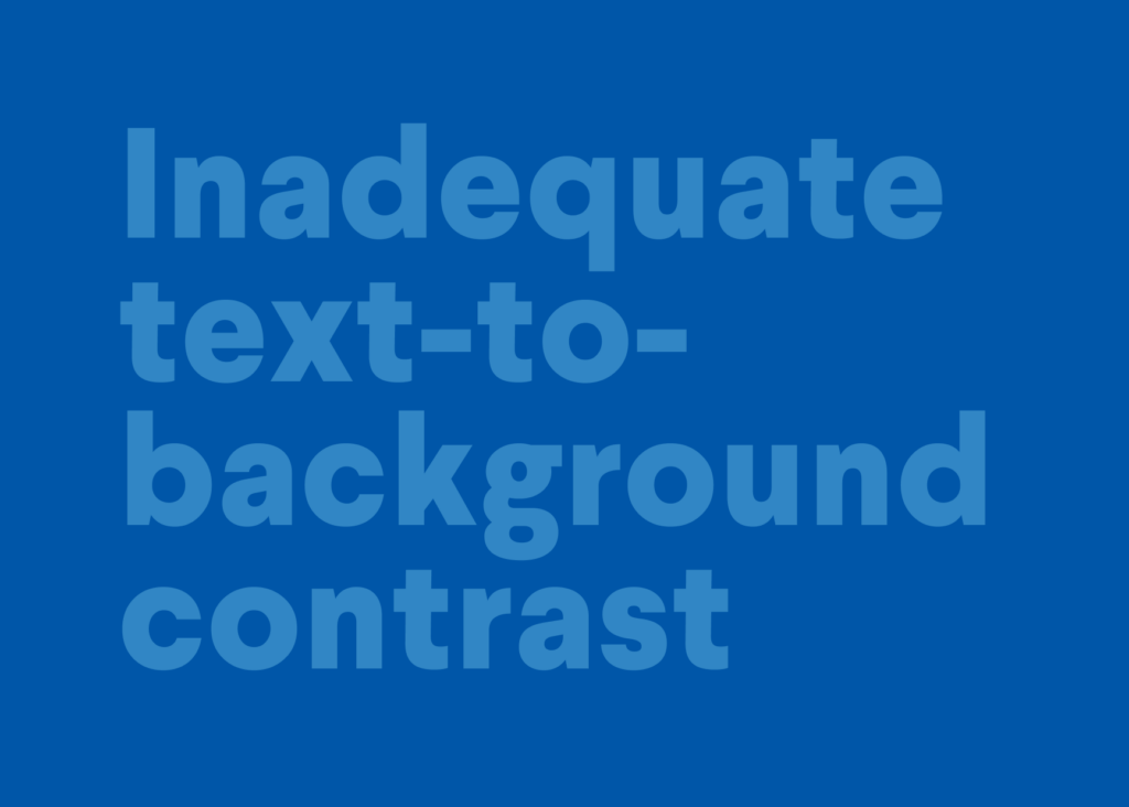
2. Adequate text-to-background contrast
It’s hard to read when the font text color is too similar to the background color. As a matter of fact, it kind of looks like this…

3. Font size and Spacing
There is no official text size for accessibility, and your website may use a range of different font sizes for effect.
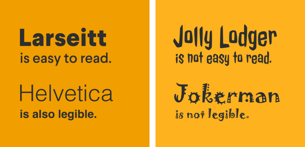
People can and will adjust font sizes on their screens as necessary. But as a good rule of thumb, don’t make any text smaller than size 16- otherwise, it might be difficult to notice it in the first place.
Font style is also important. Sans-serif fonts are generally easier to read for people with dyslexia and other cognitive challenges. Avoid exotic or unusual fonts like Jokerman.

4. Minimize complex animations
These features, unfortunately, are generally incompatible with accessibility screen readers. They also take time to download and slow down your load time. Be particularly careful to avoid animations that involve rapid flashing lights for the sake of people with epilepsy.
5. Images have appropriate ALT tags
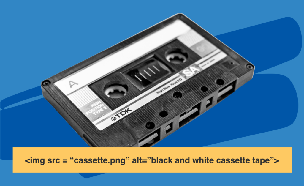
Screen readers are an invaluable tool for people with visual impairments. While they can easily read properly formatted text, they don’t automatically read images.
Instead, website developers have to supply each image with an ALT tag describing its content. By default, this is often something useless, like “IMG99.jpg”. With an appropriate alt tag, it could instead read “Man walking a dog along the beach.”

Search engines also pay close attention to ALT tags. They can tell when a website has not been updated with appropriate tags and may rank a similar website higher if it has better tags.
6. Site has a custom not-found / 404 page
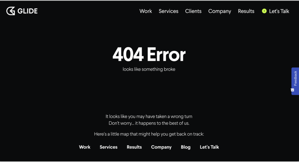
Have you ever clicked on a link, and been redirected to a “404 Error: Not Found” page? It feels weird, like being in an abandoned building where you don’t belong.
These errors happen, even to well-maintained websites. That’s why it’s better to have a custom version made instead. This is an opportunity to project your brand identity further. Look at how Google’s 404 page handles 404 errors and broken links.

The reason why this is important to accessibility is because 404 pages are often overlooked, and by default, they do not follow any accessibility standards you may keep for the rest of your website. By making a custom 404 page, you can ensure that your standards are kept consistent.
7. Use proper heading tag hierarchy
Website text is ordered in terms of the size and significance of headings. The best practice is for the H1 to be the title of the page, and each subsection an H2. Each subsection within an H2 is an H3, and so on.
The way this should be done is by organizing thoughts meaningfully into different sections, like an outline. Each H2 represents a different section, and each H3 within a section represents a meaningful subsection.
Screen readers take advantage of this fact to aid in navigation. Users can hop from one heading to the next, in the same way that you might scroll down a page while looking at it.
8. Link labels must clearly and accurately describe the content found by clicking them
Screen readers have the option to read just the links on a website, instead of all the surrounding text. They can also read out the URL associated with the link.
Links like “Click here” or “Learn more” are not very helpful in this case. They can be confusing when read out of context. The full URL is often not much better, especially if it is long and complicated.
The best approach is to use more descriptive link labels. For example, “Click here to download our white paper about accessibility” is much clearer for screen reader users. It’s also better from a copywriting perspective and may help convert visitors who are not visually impaired.
Brand Identity
Have you ever spent ten minutes browsing a company website but still felt confused about what they do? You want visitors on your website to instantly know and remember who you are and what you provide.
We recommend checking the following factors:
9. The company logo is prominently placed
Logos are powerful tools for furthering your brand presence. The more people see it, the better. Naturally familiar brand logos are found faster than unfamiliar ones.
A good logo, intentionally placed, will be consistently recalled to mind. At the very least, it should always be present in the upper left corner of the website, and linked to the homepage. Also, put your logo in your website’s favicon– that little icon that shows up on the tab in your web browser.
10. The company’s purpose is clear
The first thing your visitors should see is a clear and succinct value proposition. They should instantly understand who you are and what you offer. Too many companies offer vague services, and visitors have a hard time understanding what they are being offered.
11. Clear company information
Provide an easy way for people to learn more about the company. This includes Service pages detailing each service you provide, as well as a general About Us page. You may also choose to add information about your Mission and Values either inside the About page or as separate pages. The latter is more common for companies with a definite social purpose, like B Corporations.
12. Easy contact path
Don’t let visitors hesitate to reach out. Give them multiple options: at the very least, your email, contact form, and phone number. Make the email and number clickable with links. For local businesses, the address and even driving directions should be neatly displayed.
Don’t make your contact form any more complicated than it needs to be. A complicated contact form will scare away potential customers or clients. A simple Name – Email – Message is usually all that is needed.
Also, your contact information should be placed in HTML text, which is easier for Google to read. That lets them pick up relevant information, such as your location.
13. Trust-building elements
Trust is a rare and valuable commodity on the internet. You should prominently display social proof like testimonials, client logos, and case studies throughout your website.
Also, be sure that your website connection is secure for protection and for usability. People do feel differently when visiting an https vs an http website. And Google uses https as a ranking signal.
Navigation
It should be easy to explore your website and find information. Period.
In a sense, the right way to do this was established over 20 years ago. People expect to see a homepage with a header and footer, as well as a menu or sidebar that links to pages like About Us and Contact. That said, your website should be faster and look prettier than something designed in 2004!
To ensure that navigation is usable, we recommend checking the following:
14. User orientation is clear
Visitors should know where they are on your website and where they can go. Each page should have a title and a clear, distinct purpose. Each link should be well thought out and clearly labeled.
For example, menu labels should clearly describe what the page is about. Avoid using “Contact us” when you really mean “Schedule a demo.”
15. Menu is prominent, consistent, and concise
Give the menu prominence by placing it in an area that’s easy to see, like at the top of the page.
Navigation should be consistent from page to page or sub-website to sub-website. The headers and footers of a website should be the same for all regular web pages.
Avoid including too many menu items- five or six is plenty. If you have other pages, ask yourself if they are really important enough to belong on the menu.
16. Menu is intuitive and has a logical structure
There’s no need to reinvent the wheel here. People already expect to see something like Home-About Us-Services-Contact at the top.
Make sure that only the essential pages are in the main menu- less is more here.
And choose menu items that affect SEO. Google uses menu items and navigation to understand the structure of a website. This lets it rank your content based on how important it is to the rest of your site.
17. The logo is linked to the homepage
Website visitors should be able to return to the home page at any time by clicking the logo in the upper left corner.
18. Navigation labels are clear and concise
Users should know exactly what they find on the destination pages of each menu item.
19. The number of buttons and links is reasonable
Throughout all pages, the links and buttons offer some but not too many choices to visitors. If you have too many, this can confuse them as to what action to take. More than two per paragraph is usually too many.
20. Each page has a main call to action
Ensure that visitors have an opportunity to engage with you at every single moment. A good rule of thumb is to make sure that a call to action is always visible, no matter where you are on a page.
21. Site search functionality
Incorporate a search function that is easy to access to save users time and better assist them in finding everything you have to offer. We like using WP Smart Search.
Labeling
Labels include category identifiers, naming conventions for buttons, website navigation, and links within content. Good labels simply indicate what will happen if you click on something.
Our labeling checklist includes the following:
22. Labels are concise
Labels should always be concise and written with terms that your website visitors would use.
23. Page titles are relevant
Every page title should relate to the labels found in the content on that page.
24. Links are clear links
Links should be consistent, easy to identify, and separate from the surrounding text.
Visuals
Humans are highly visual creatures. Aesthetic design choices affect us on a subconscious level, even if we are not aware of it. You might have been to a website before and felt that it just felt “off” without knowing exactly why. Most likely, there was a subtle visual issue that was making you feel uncomfortable.
When it comes to visual design, there is no end to the subtlety involved. Graphic designers should probably have their checklists to work with. But as far as the high-level visual characteristics of your website go, we recommend checking for the following:
25. There are clear visual cues
Use contrast and spacing to draw the eye where you want it. Make important elements easy to find with color or scale. Use color to guide the eye around the page.
26. Zero clutter
If you don’t need it, delete it. Everything else will stand out more.
27. Responsive design
The site automatically adjusts to fit different screen sizes and devices. Don’t be afraid to test this by loading your site on different computers, mobile devices, and tablets.
28. Design is clear and clean
The content and design are clear, clean, and aesthetically pleasing. Browsing the internet can bring in so much disjointed information, that the effect can feel chaotic and even overwhelming. A good design will feel like an oasis from that chaos.
29. Design must be based on the company’s brand guidelines
A consistent aesthetic across all company materials is important for establishing brand identity and staying present in visitors’ minds. It’s also helpful for when visitors have multiple tabs open between different websites, and can quickly identify yours.
Consistent design is also important for the inside of your company. It helps promote a sense of coherence among your team.
30. Layout structure is optimized
The layout should be structured for maximum legibility and readability. Make sure each panel on a page flows intuitively into the next one so that visitors will want to keep reading. And break up walls of text into short paragraphs.
31. There is a content hierarchy
Content and design should be presented in a clear hierarchy that supports how people read online.
Check out some examples of good design here.
Content
If you plan to attract visitors through high-quality content, you should make sure that that content is easy to find and navigate through.
32. Content is organized
Information should be presented logically and in order of importance. Visitors should see immediately what they are about to read or watch so that they won’t click back and visit other website pages.
Make sure that there is something to hook visitors in above the fold- a good intro or outline is a good way to start.
33. Language is natural
The appropriate kind of language to use does vary, but in most cases, you should speak to visitors as you would speak to friends. The main exception is for highly formal contexts where a more precise, clinical tone would make more sense.
Avoid the trap of writing weirdly for search engine optimization. Natural language always works better in the long run.
34. Copy is concise & explanatory
The best copywriting gets out of its own way by simply explaining the good or service on offer.
35. URLs are meaningful & user-friendly
It’s better to have short URLs laid out in a clear, hierarchical manner. They should have a name that accurately reflects their contents, to help search engines understand what they represent.
36. HTML page titles are explanatory
The <title> tag is important for signaling to search engines what the contents of your web page are about. It is what the search engine will display for your website in the search engine results page.
The <title> tag also provides a name for the site when added to favorites, and is visible in the browser toolbar.
37. Major headings are clear & descriptive
Headings are used to describe, organize, and demarcate text. Users should know what to expect to read underneath a heading.
Forms
Contact or submission forms are important points of communication. They are often among the first major two-way interactions a company has with a prospective customer or client.
You shouldn’t rely on contact forms to the detriment of other forms of communication, such as email or phone. But many visitors do prefer the option.
38. Simple instructions
For many forms, all you really need is a name, email, and message. A simple email signup form really just needs an email address.
The more unnecessary information you add, the more confusion gets thrown in. Any form should really speak for itself in how to use it.
39. No unnecessary steps
Asking for less information may result in a higher submission rate. For consumer forms, removing a field results in up to a 25% higher conversion rate. Ask yourself if it’s really important to know their budget, middle name, or favorite flavor of ice cream.
40. Deliver what you promised
If you offered something in exchange for filling out the form, make sure you deliver it!
Not sure if your website is usable or not?
Glide Design specializes in building, designing, and improving websites.
Do you need your website audited for usability improvements? We’d love to help!

Discover the key insights on how AI-driven search is reshaping digital visibility.