Pen testing and security for enterprises
Pen testing and security for enterprises
Creative direction: Drew Lyon
Project manager: Kimberly Yount
Content strategist: Jessica McDaniel
Lead designer: Gretchen Bice
What We Did
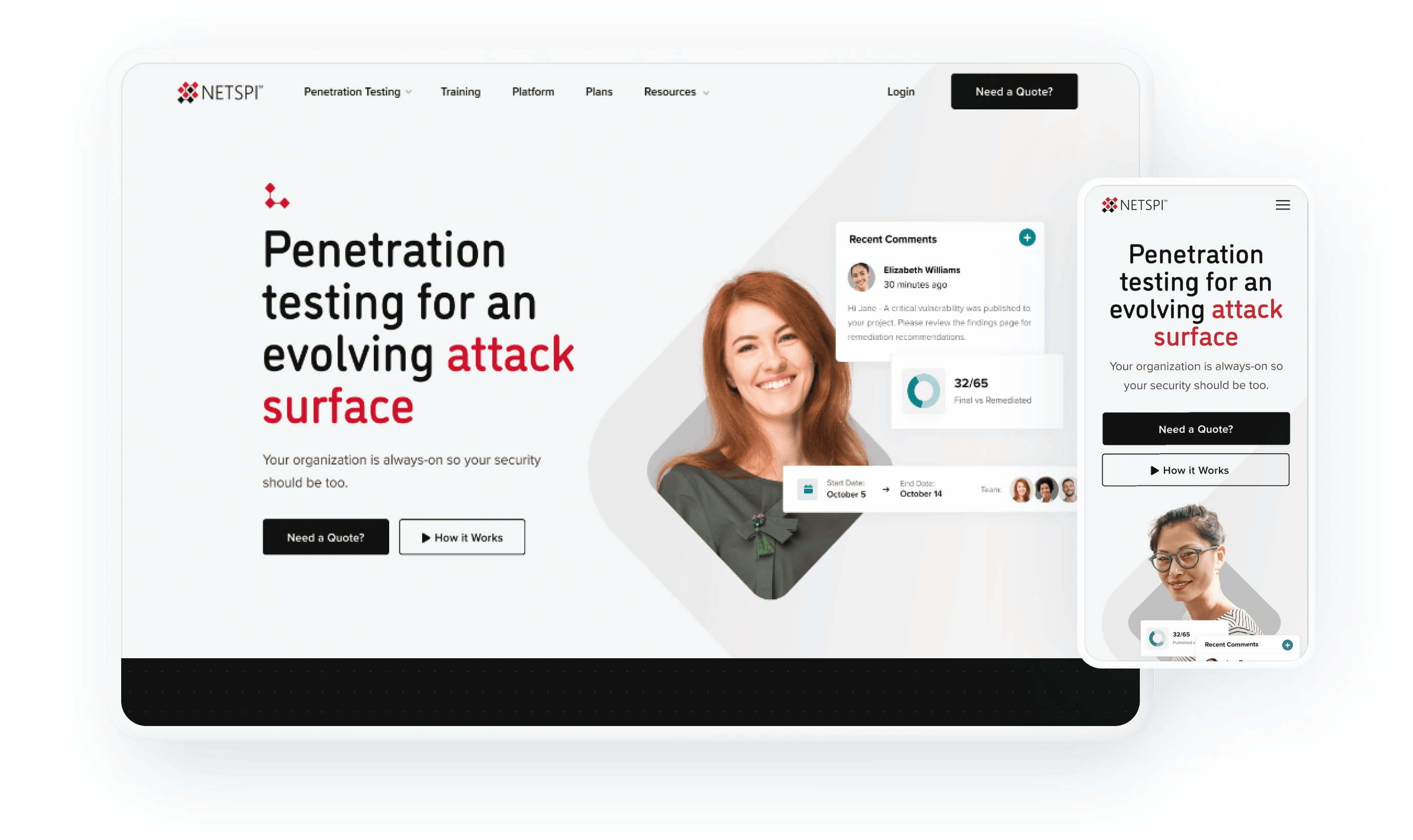
This project was a good reminder that you don’t have to be a SME (Subject Matter Expert) on something in order to make a website for it. However, you do have to know where your expertise ends and your client’s begins. In the event of NetSPI (a Pen Testing and Security solutions provider), we focused on clear site architecture and clean styling, while deferring to them on matters that were a bit over our collective heads.
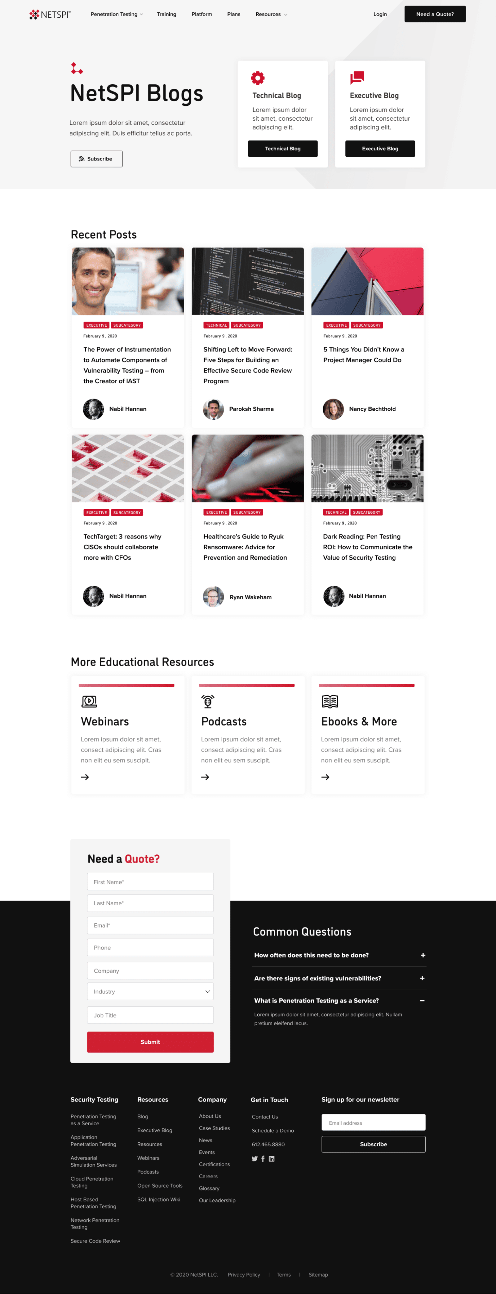
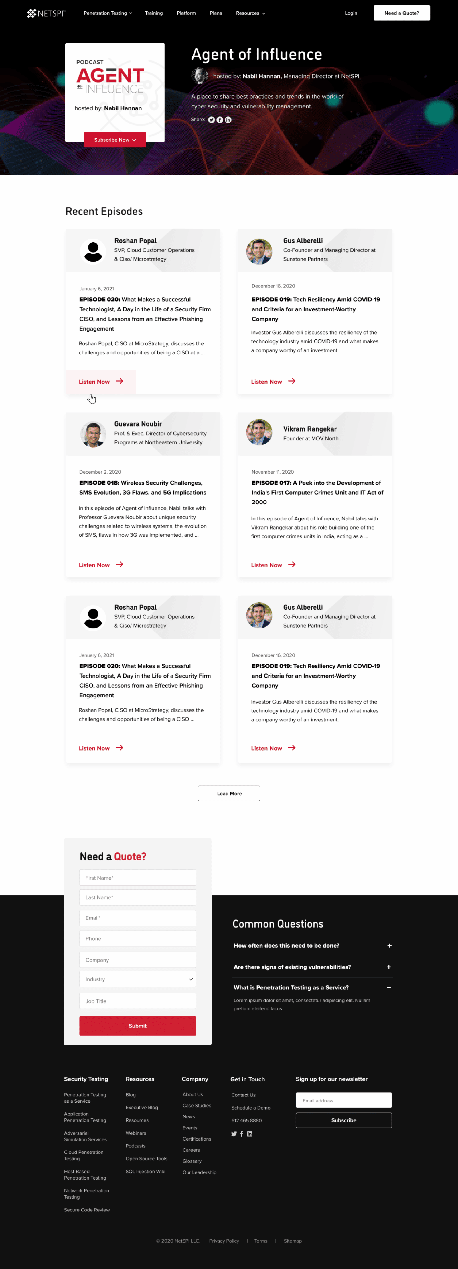
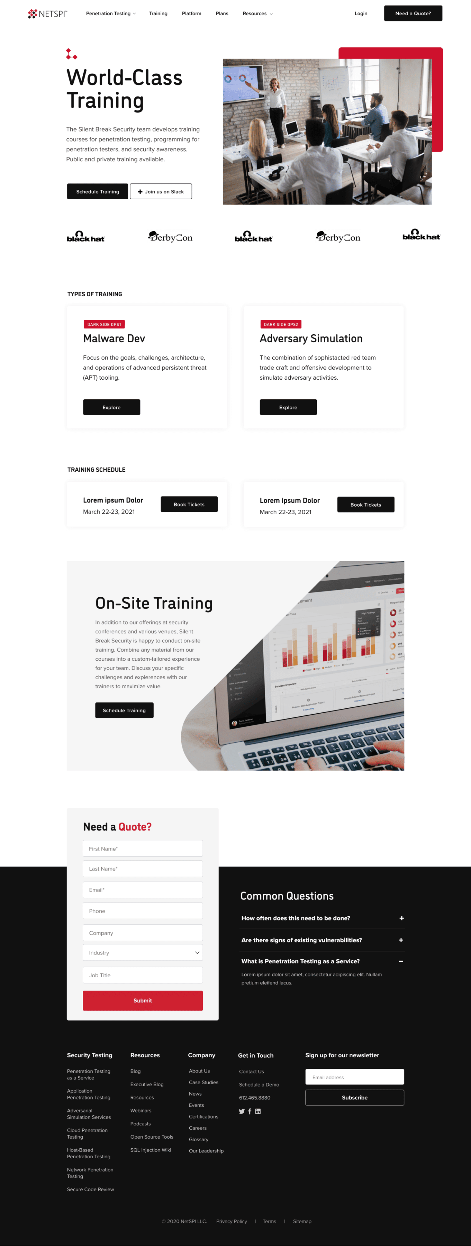
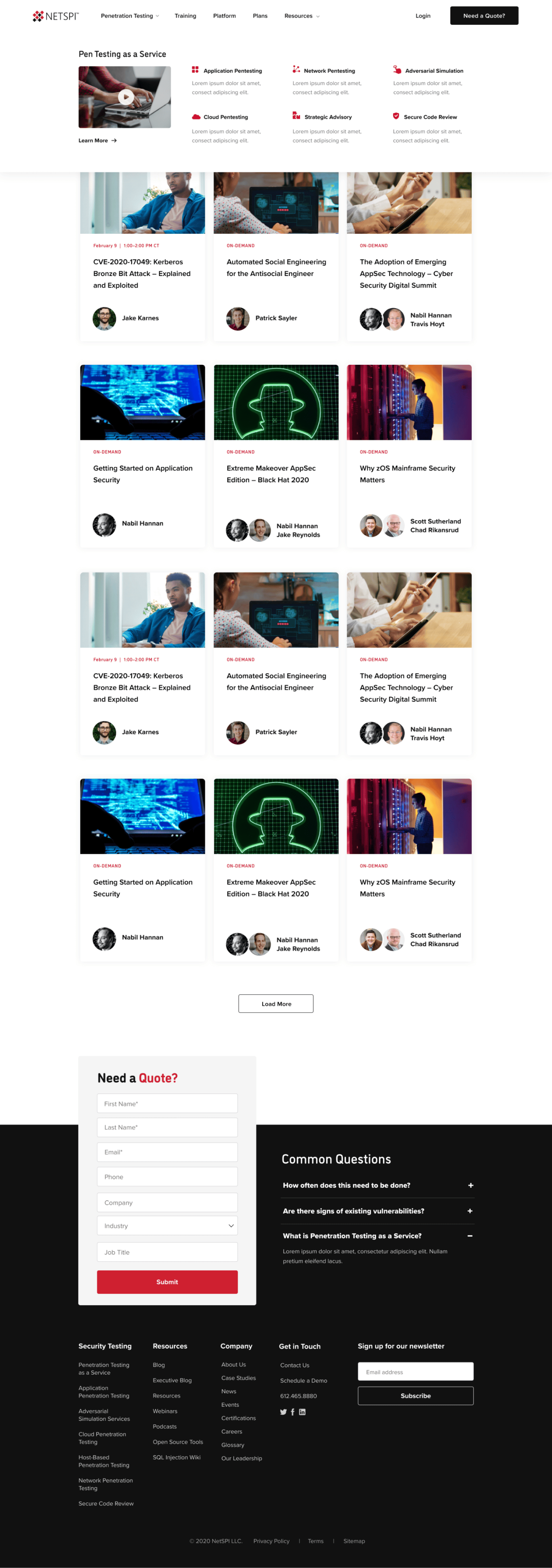
If I had to pick one element on a website that most impacts the user experience, the answer would be obvious. Primary navigation. For NetSPI, we went through several rounds of discussion on how to group pages, followed by creating a visual site map to show which pages are elevated, before finally designing a two-level mega-nav UI. But don’t let that scare you. The process may sound intensive, but the result is intuitive and direct.
WHAT WE LEARNED
The nav helps people get from page to page of a website, but that doesn’t do much good if the desired actions never get completed. Like most marketing sites, the primary action on the NetSPI site is lead generation. Of course we have a Quote page, but on the bottom of EVERY page, we have a short lead gen form pinned to the footer. Repetition is a valuable tool in our conversion science kit. so we err on the side of surplus when it comes to CTA buttons and forms. Every page leads to the finish line—should you choose to cross it.
