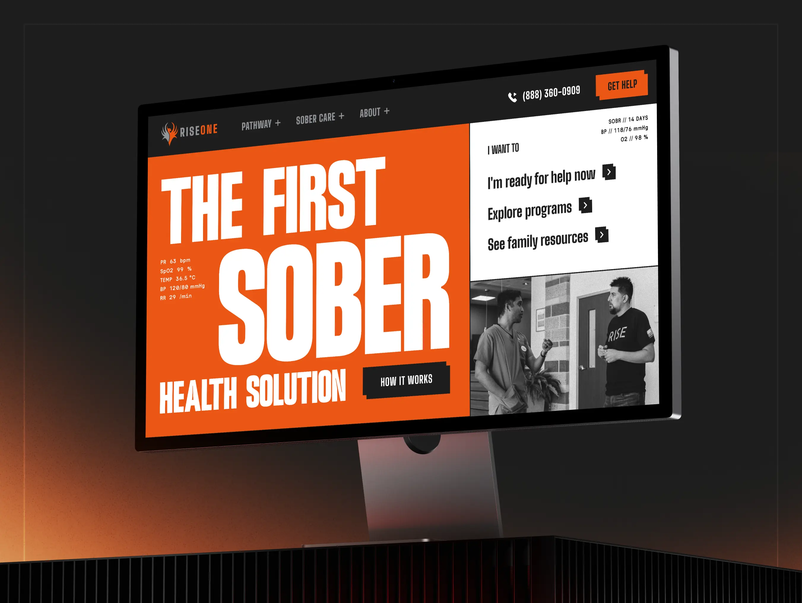
RISE treats addiction and mental health, and it earned trust in person for nearly twenty years, growing almost entirely by word of mouth. Now it was stepping into a bigger identity: a new brand, a consolidated footprint, and a broader system of care across Texas and Louisiana.
RISEONE
From location-first rehab to a system of sober care
Overview
Background
Problem
Most people find RISE on the hardest night of their life, yet the old site was built around locations and buried the care they were actually searching for. It also had to hold trust with three very different audiences at once: families in crisis, patients, and the providers who refer them.
Solution
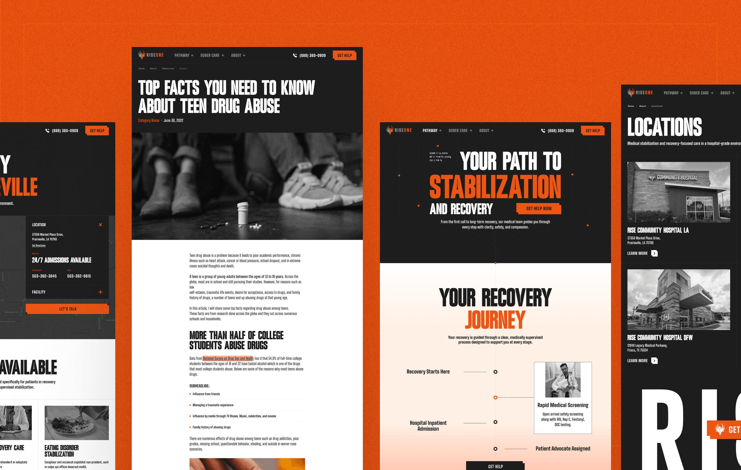
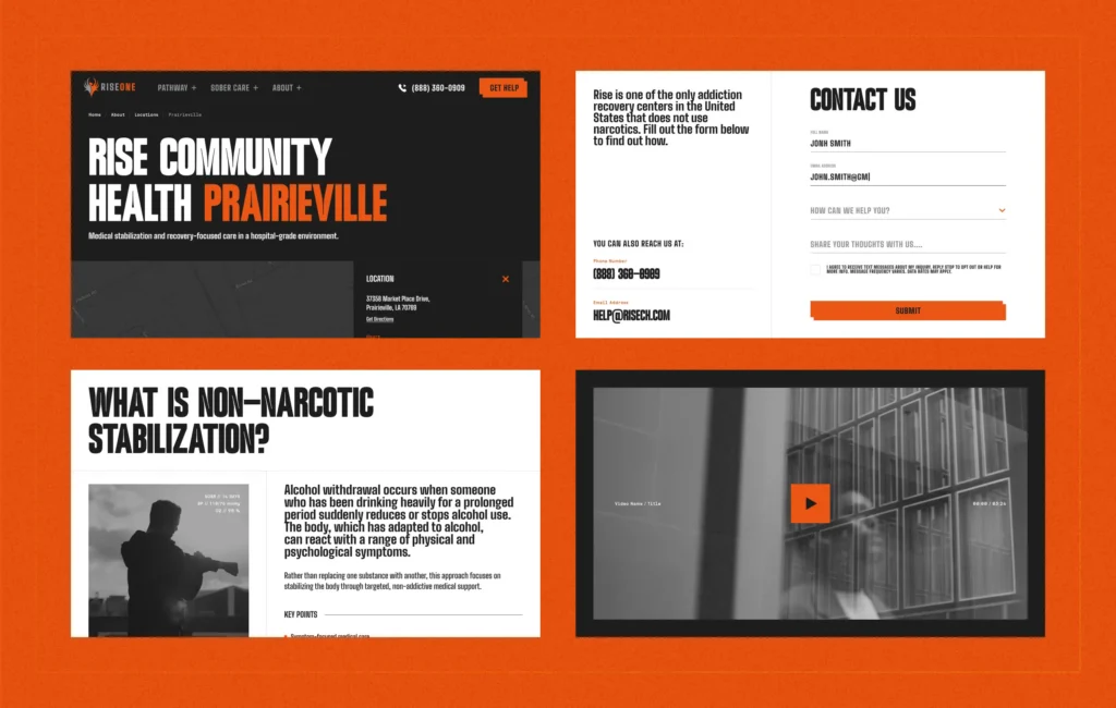
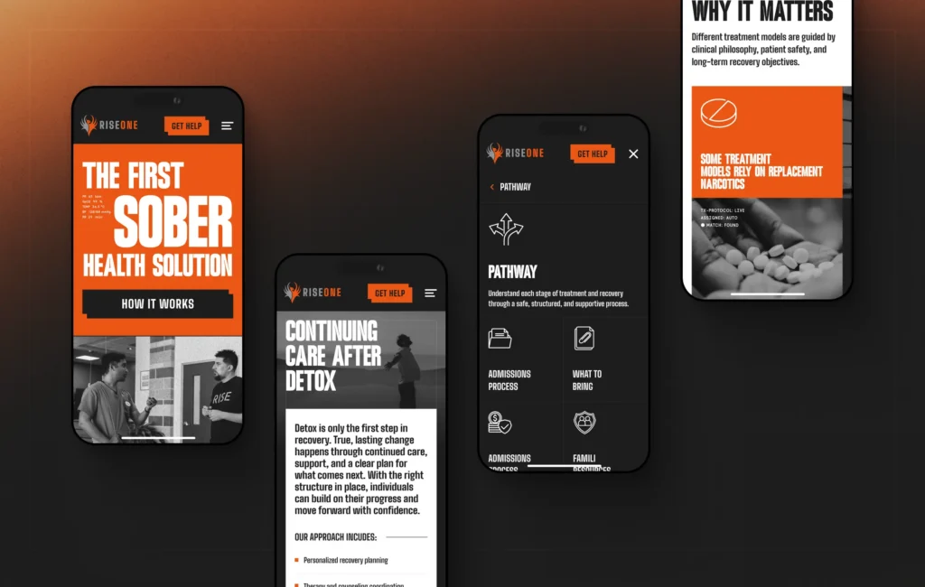
We rebuilt the site around what someone needs in the moment they reach out, not around geography. Each audience gets its own path from crisis to safety to relief, with locations repositioned as proof and routing rather than the front door.


Designing for the moment someone reaches for help
A family in crisis does not read a website, they scan it for a reason to believe. So we put the proof where it lands first. A counter of treatment stats treated sits near the top of the homepage, turning nearly twenty years of quiet, word-of-mouth reputation into a number a stranger can trust at a glance.
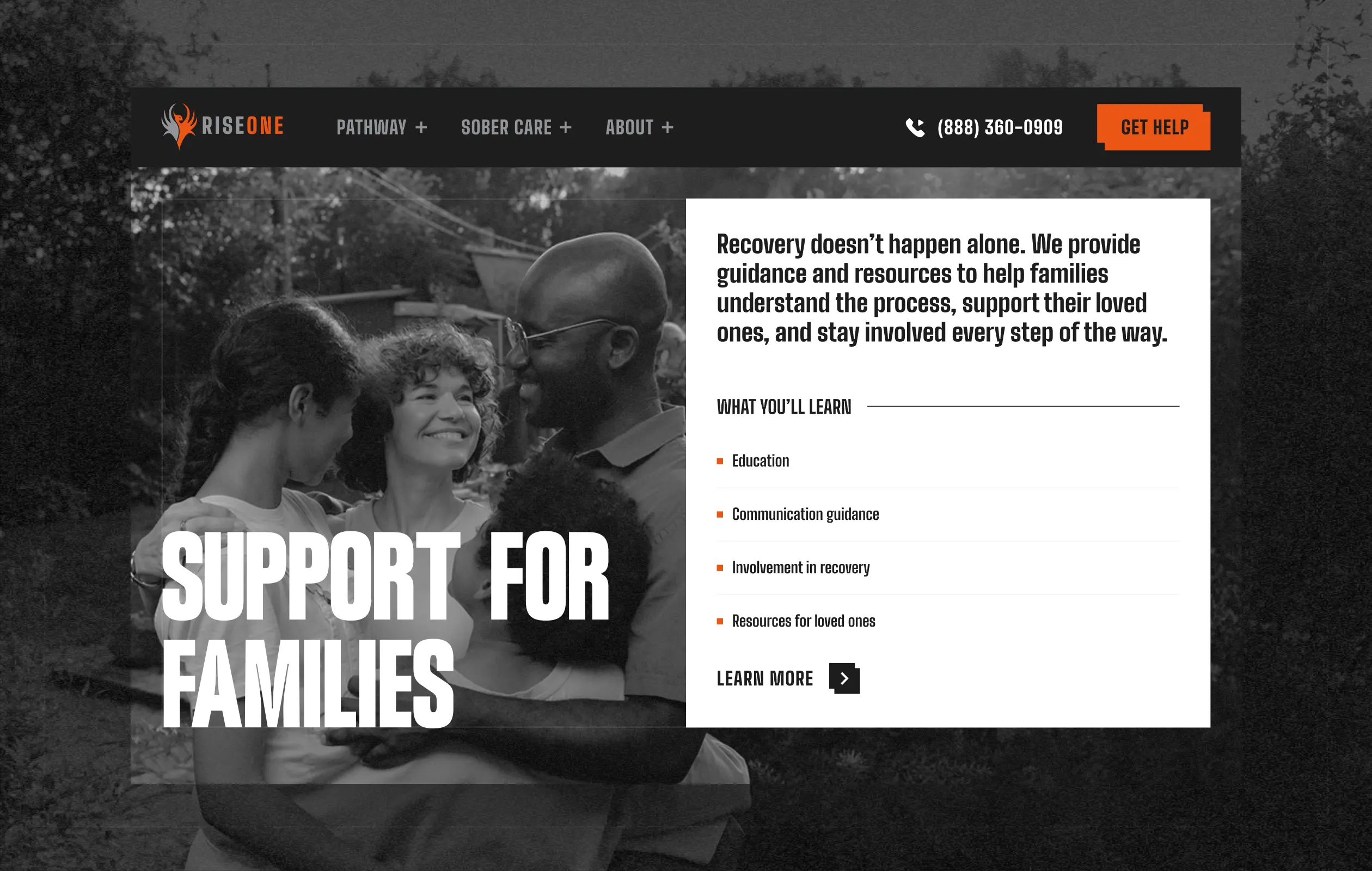
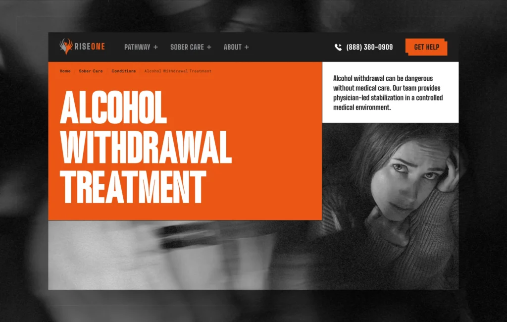
Across the site, a single grayscale photo treatment does two jobs at once. It pulls a mixed set of imagery into one cohesive, human tone instead of a patchwork, and it sets RISE’s bold color and typography apart from the interchangeable blue-and-white sameness of most healthcare sites. The authentic proof comes from the community itself: real alumni and event photography of people in their RISE shirts, evidence that recovery here comes with a family attached. The warmer identity and phoenix motif carry the rest, signaling confidence so RISE reads as a leader rather than one more clinic.