12 Website Conversion Killers (and How to Avoid Them)


Discover the key insights on how AI-driven search is reshaping digital visibility.
Learn sure fire ways to drive website visitors and conversions away, as well as some practical ways to turn things around and increase your website conversion rate.
Did you invest in a website that doesn’t perform? After devoting the time and money into a new website, it is an enormous disappointment when it fails to bring in new customers or clients.
The factors that hinder site performance are very specific. If your company website is not bringing in a steady flow of new clients/customers online as well as successfully converting them. Review the following factors to see how your website measures up.
1. Bungled SEO
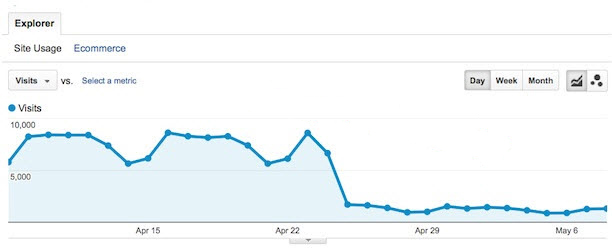
If your original site was performing well, and a new site fails to maintain and further expand an established performance record, the total number of site visitors will plummet. Less traffic means fewer conversions. When you’re creating a completely new site, managing this issue is less important than when redesigning an existing site. Lots of work has to be done on high-performing or decently-performing optimized sites to maintain current standings and build upon them to improve search rankings.
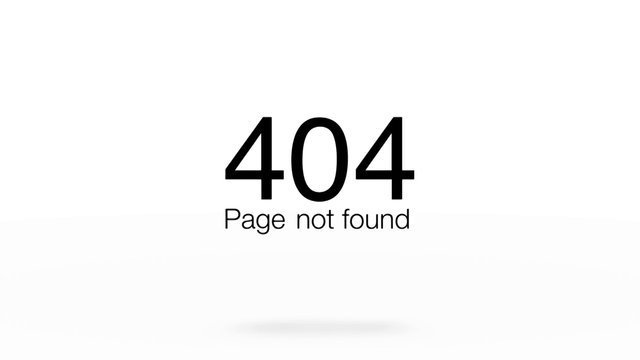
2. Killing Important Pages
People can only get to your site in one of three ways.
- They type your site address directly into their browser, called “direct.”
- When clicking on a link in an email or website, this way is termed a “referral.”
- When using a search engine, this is simply called “search.”
Most commonly, new visitors will land on your site primarily through referrals and search. If a new site kills important linked pages (without redirecting them to something relevant) then all the love those pages garnered from inbound links and search will die with them. There goes your traffic – and your conversions.
Updating an existing site will require careful attention to these issues so find a website design company capable of managing these critical issues correctly.
3. Distracting Design
The design of your site creates the initial attraction for people searching for goods or services. Unfortunately, many sites are grossly “over-designed.” The graphics distract from the message, failing to captivate interest.
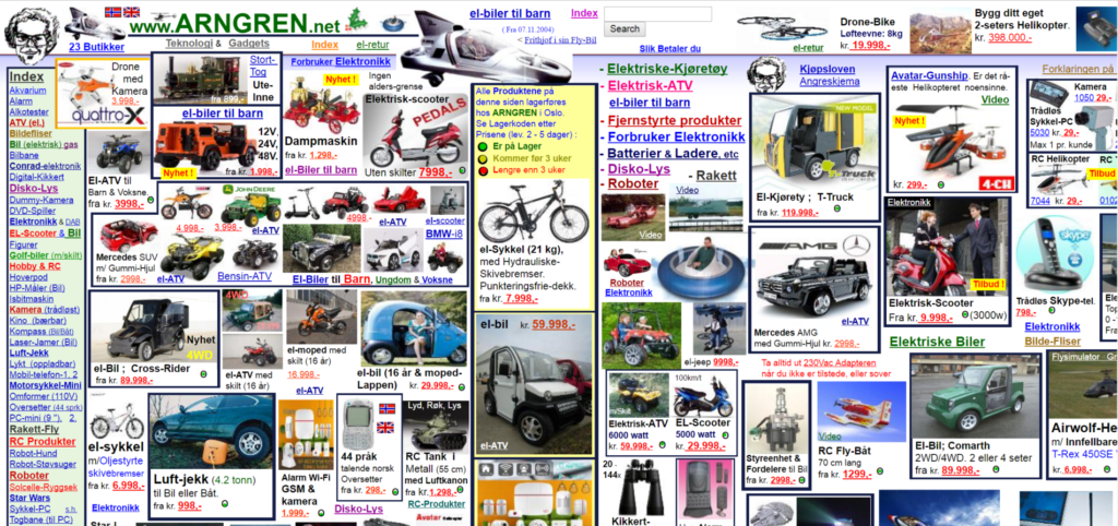
Our experienced website designers and developers at Glide Design in Austin have a thorough understanding of online user behavior, emotional responses to color and design, eye tracking, and how profoundly usability impacts response. A distracting design creates confusion and ultimately, lack of interest – there is just far too much “noise.” Visitors leave, usually never to return.
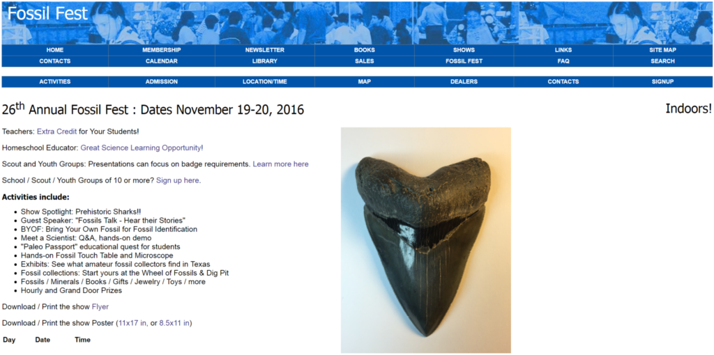
Simplicity is the hallmark of effective web design…like this:
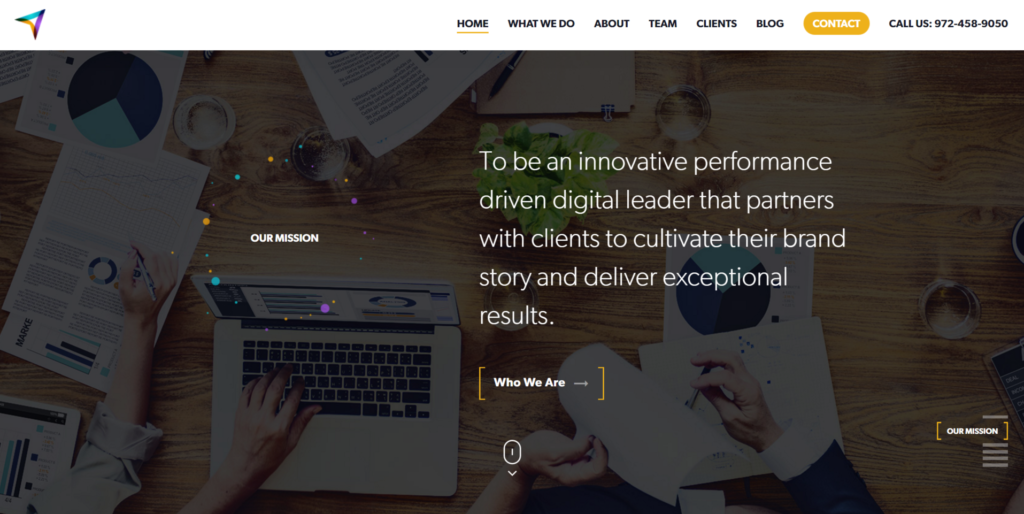
4. Outdated Design
An outdated design repels users. In fact, a Time magazine article reveals that we have 15 seconds to hook our audience online. While it is true that design fads come and go, a well-executed, customized site design has longevity. If your website design looks old and clunky, with fonts and colors that harken back to an earlier decade, it gives visitors the impression that your business is out-of-step and less reputable. Older sites are also typically slow-loading. Web users are savvy, impatient, and won’t wait for a clunky, outdated site to load – they bounce.
Does your website design convey the brand you aspire to?
5. Few Opportunities to Convert
Website visitors must be given clear opportunities to convert. In many cases, a reputable business will get next to nothing from their site, merely because they do not provide visitors with opportunities to convert. This doesn’t mean a site with flashing banners, or a call to action that looks like messy, blaring ad copy – users do not appreciate being bombarded.
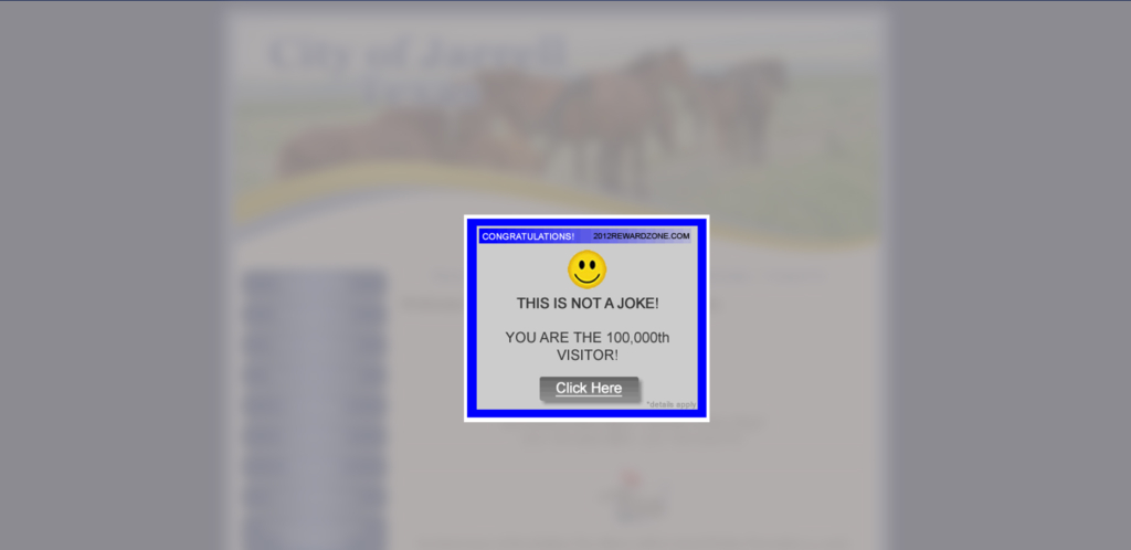
Provide them with clear, straightforward methods to connect with your business, to take advantage of a special offer, or to place an order.
The easier you make conversions, and the more natural it feels to a visitor to click through, fill out a form, request a quote, or other action, the more it will occur. The science underlying this crucial aspect of your site includes an understanding of response to color, space, design, online user behaviors, eye tracking, and site functionality.
How many clicks does it take a first time visitor to locate key information and fill out a form on your website? Just like golf, we’re looking for a low number here.
6. Bad Mobile Experience
Even today, many businesses either don’t have a website, or have a site that won’t function on mobile devices. That is a situation that means lost business, in volume. Many people are in transit when searching, and if your site is mobile-responsive, functioning perfectly on any screen – new customers will arrive at your door, or contact your company directly. A bad mobile experience is frustrating, and essentially hated by visitors. They don’t want to pinch your site to read it, and they don’t want to work to find out how to contact you. This leads to a lower opinion of your brand.
When you open your website across different mobile devices, is the navigation easy to find and are the images visible without zooming in or out?
7. Calls to Action Fail to Inspire
If you want conversions, you have to create a user environment that makes it possible. A vital aspect of this process is the skill with which a clear “call to action” is placed on the page. Contrast and spacing must draw eyes, with clear visual cues on where to go next. The process of drawing in a user should feel natural and effortless to the visitor. Don’t make them work to attempt to contact your business or place an order!
Calls to action are one of the most critical of all website design elements. They must be easy to see at any point on the page, and be crafted to inspire a response. A clear call to action informs site visitors what to do next, and directs them to the next step. Let them in!
Clear, simple design elements will ensure the flow and eventual conversion of your online visitors. Do your calls to action stand out effectively?
8. Content Fails to Answer User Questions
Users type questions into the search bar. The search engine results page gives them options to choose from. If your content does NOT answer the question posed, it creates a negative impression of your brand. Of course you want high numbers of site visitors – but you want them to stay. To achieve this, provide them with the answers they are looking for.
Provide content that is coherent, relevant, accurate, and all offered in a simple, easy-to-navigate format.
9. Users Forced to Sign In Without Benefit
A site that requires you to sign in before getting the opportunity to read more – with absolutely no benefit – will drive off potential clients or customers.
To capture identities, you must offer something that your defined market segment wants and needs.
10. Site Is Confusing and Difficult to Navigate
Make it possible for your site visitors to move through your website without struggling to figure out how. If you have a massive menu of pages, it makes the process of navigating your site confusing.
Take time to ensure that the essential pages are on the main menu, and that the information most commonly searched for is presented in the correct order of importance.
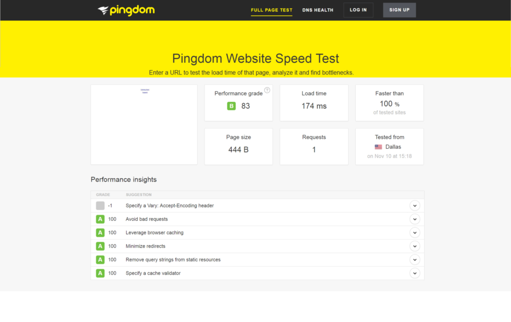
11. Slow-Loading Pages
The skills involved in creating fast-loading pages are a critical part of the design process. Slow-loading pages will rarely be viewed – sophisticated users just bounce if the page won’t appear within seconds, whether on a laptop, desktop, smartphone or tablet.
Try out a third party site like this to measure your website’s load time.
12. Site Attracts the Wrong Users
You may be attracting many site views – but from the wrong users – they don’t stay, don’t buy, and will not turn into new customers. It may be that your site appeals, but to the wrong users. When designing a site, it requires establishing your goals, identifying your audience, and researching the competition.
Your design, both in aesthetics and usability – must appeal to YOUR ideal customer. That takes insight, research, and a focus on user response specifically for that niche market.
Looking for more help with your website conversion?
Talk to us at Glide Design in Austin, where we create custom, best-in-class websites for a range of industries. We guarantee 100% client satisfaction, and only promise what we can deliver. Expect honesty, integrity, responsive communication and client-focused service.
Discover the key insights on how AI-driven search is reshaping digital visibility.
Discover the key insights on how AI-driven search is reshaping digital visibility.